UPDATE 2024: Not all work is displayed. For a deeper dive into my case studies and design process please contact me
-
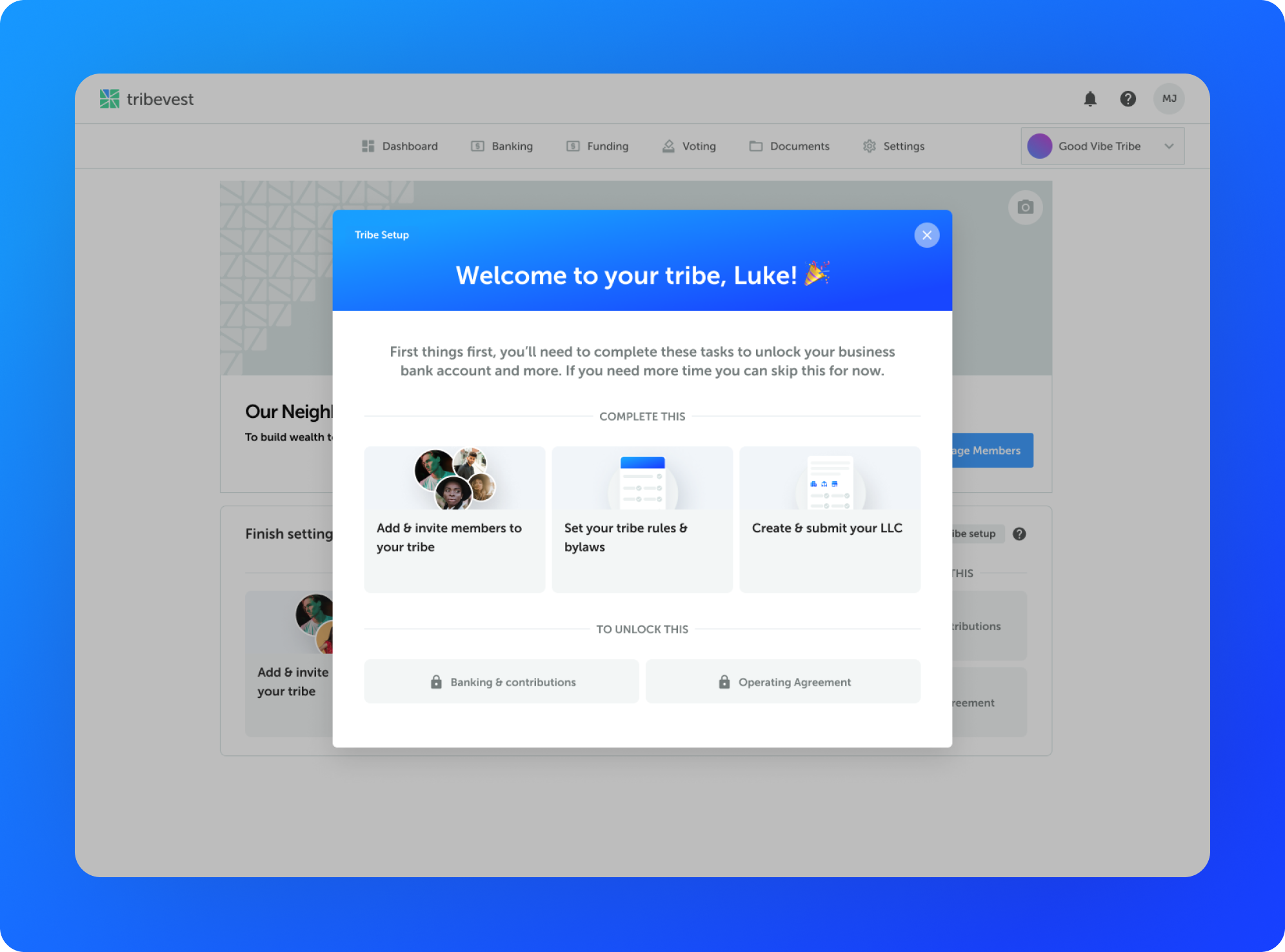
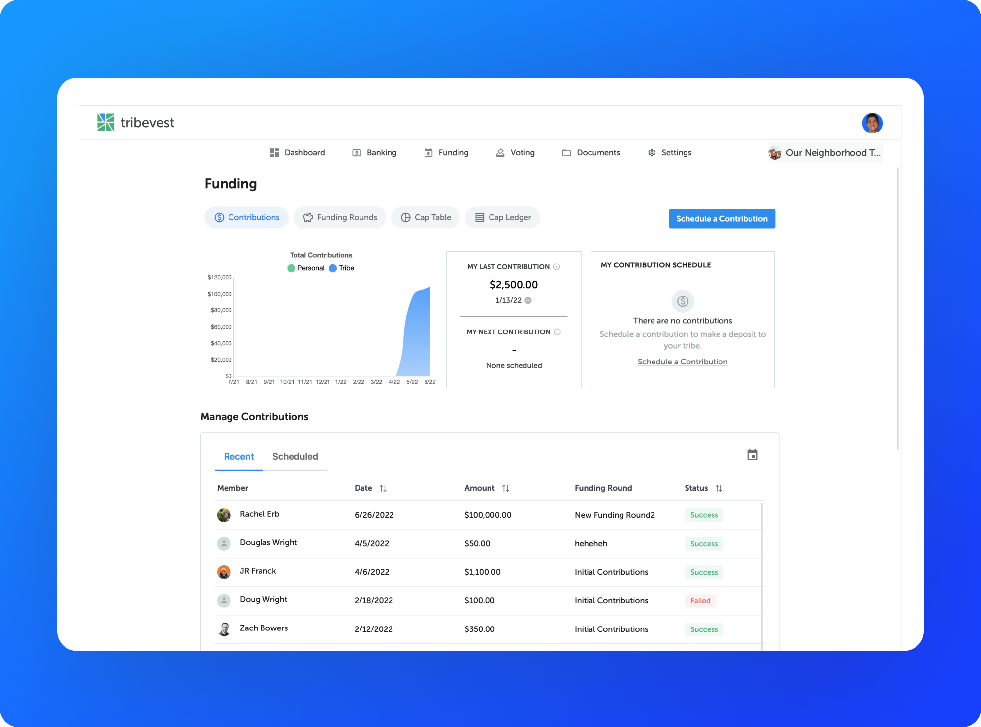
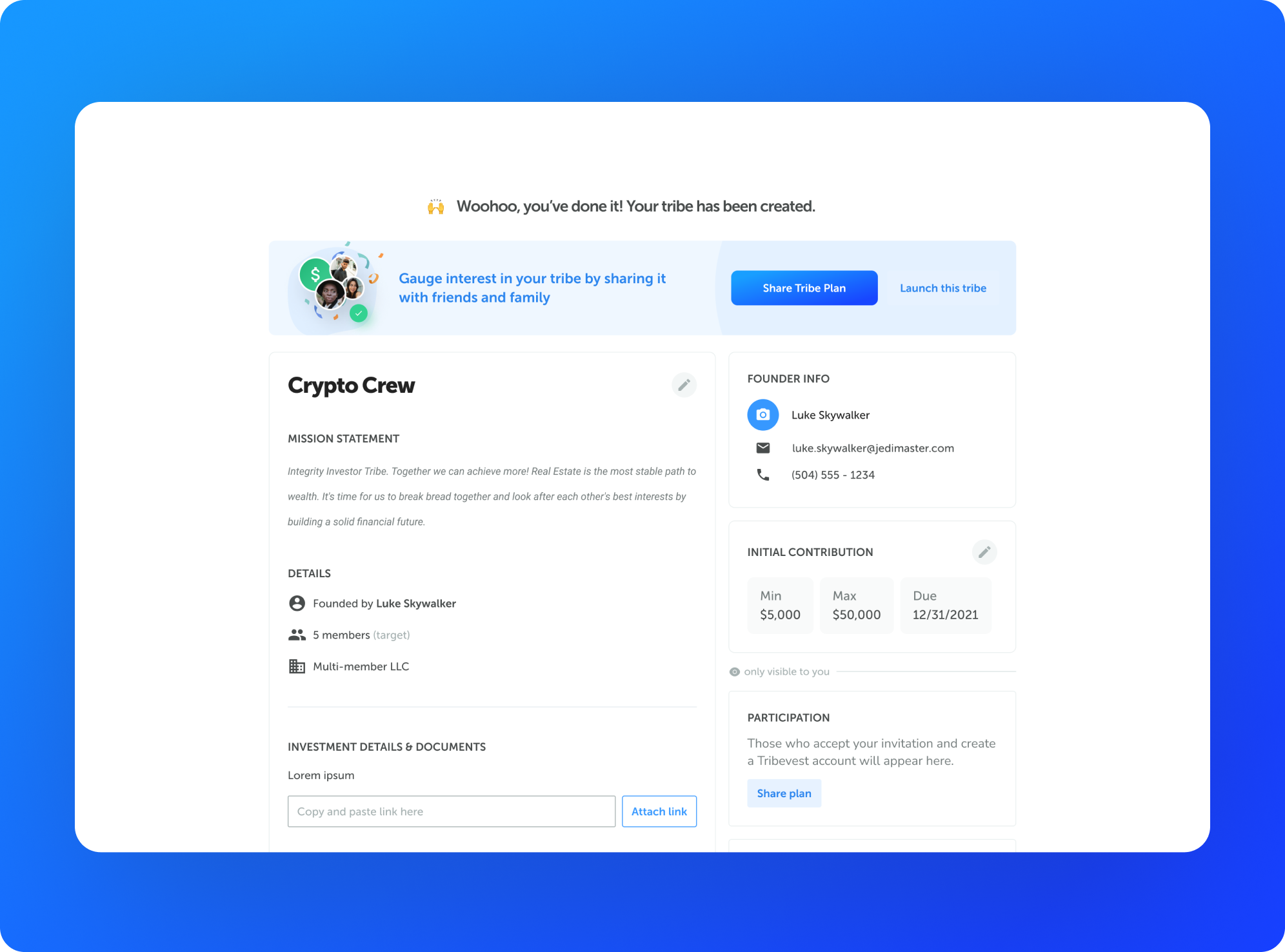
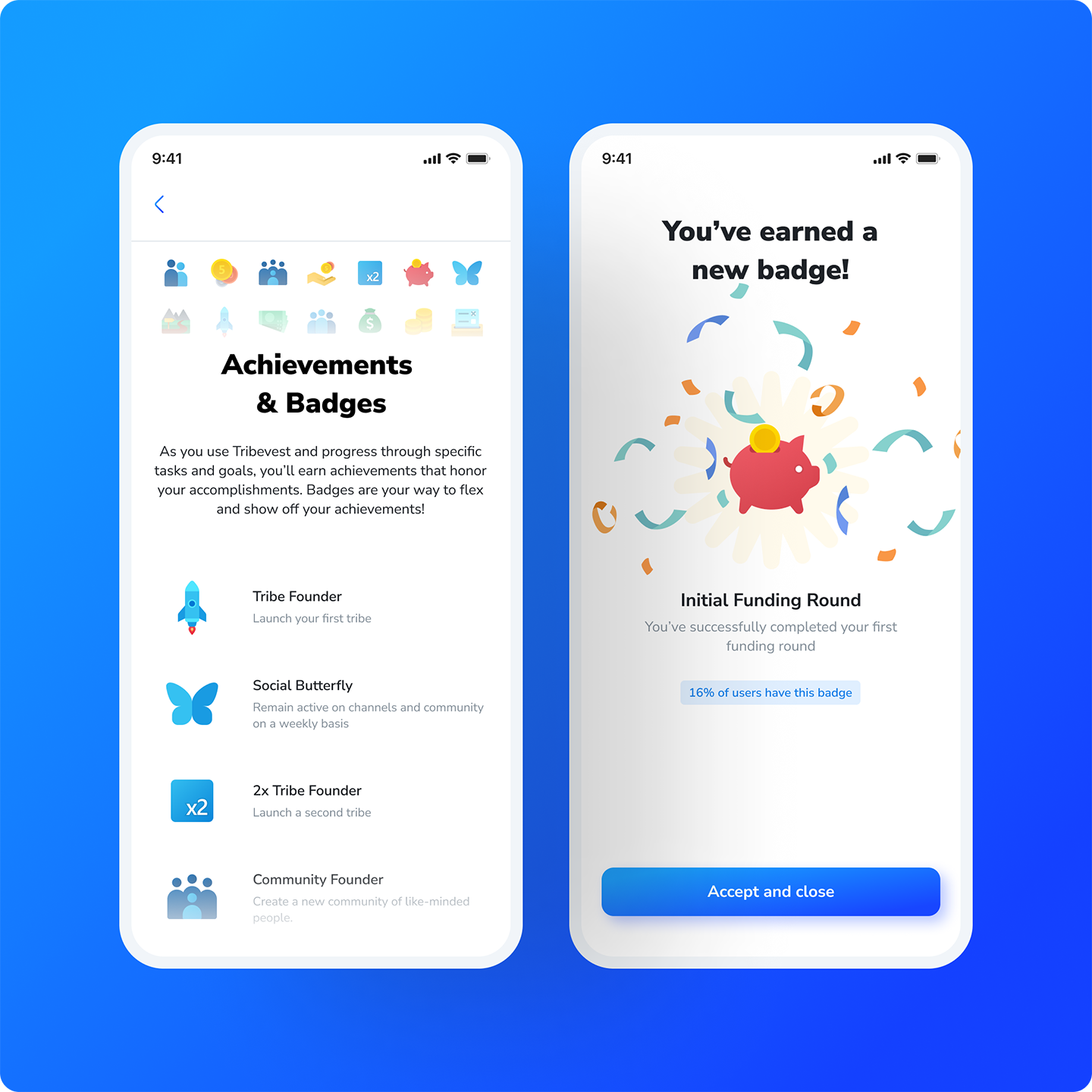
Tribevest
Head of Design
Responsbility
Product StrategyCross-team CollaborationProduct LifecycleImproving Key MetricsUser ResearchUsability StudiesUX DesignInteraction DesignTools
Figma. Slack. Google. Email.
2021 - 2022 More info coming soon. -
-
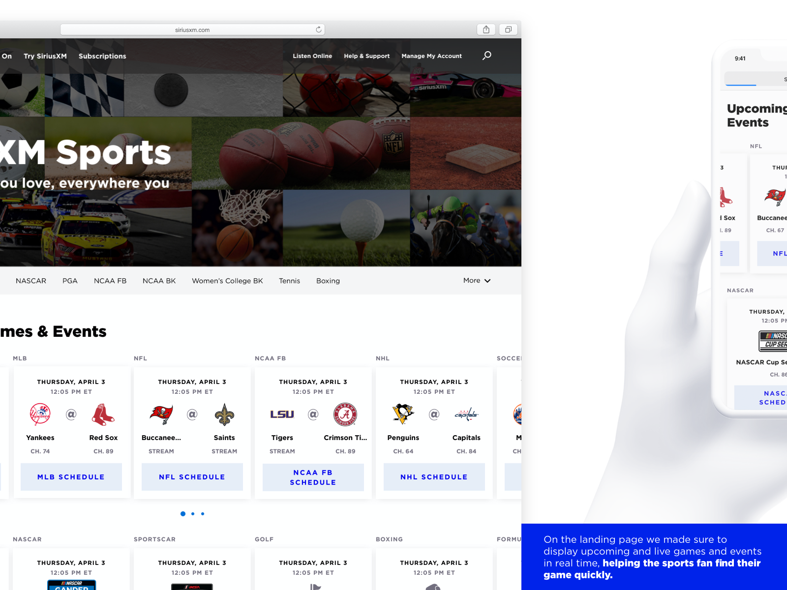
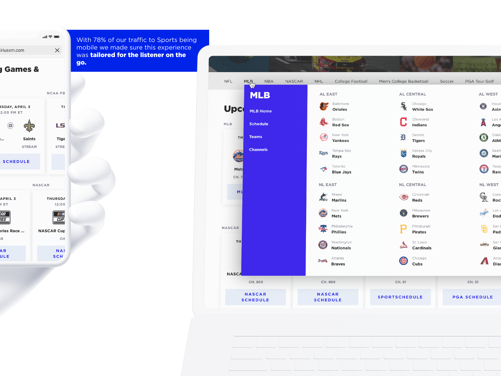
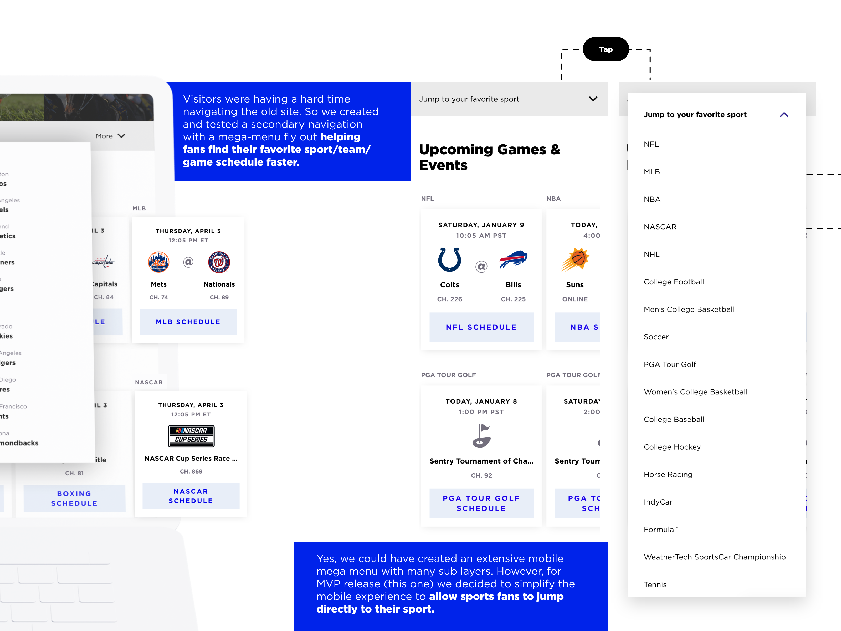
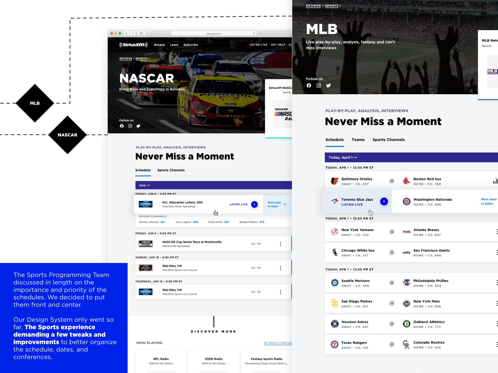
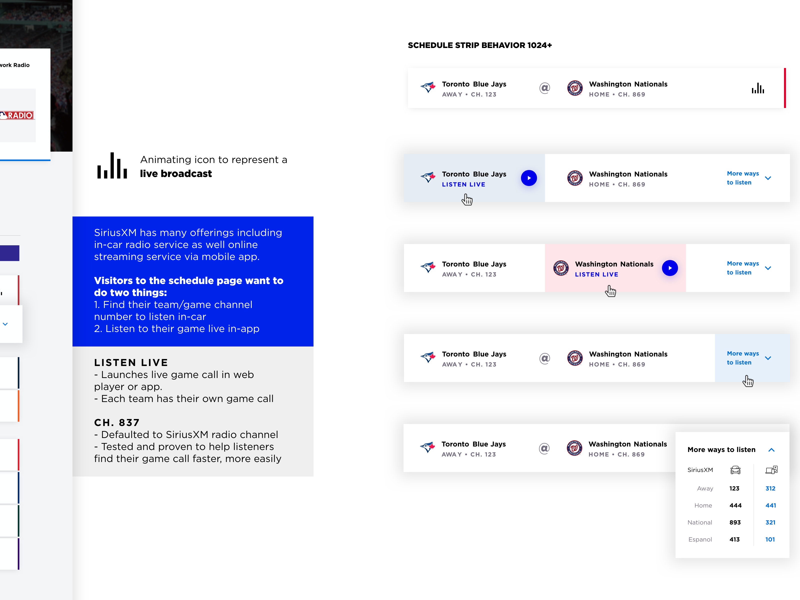
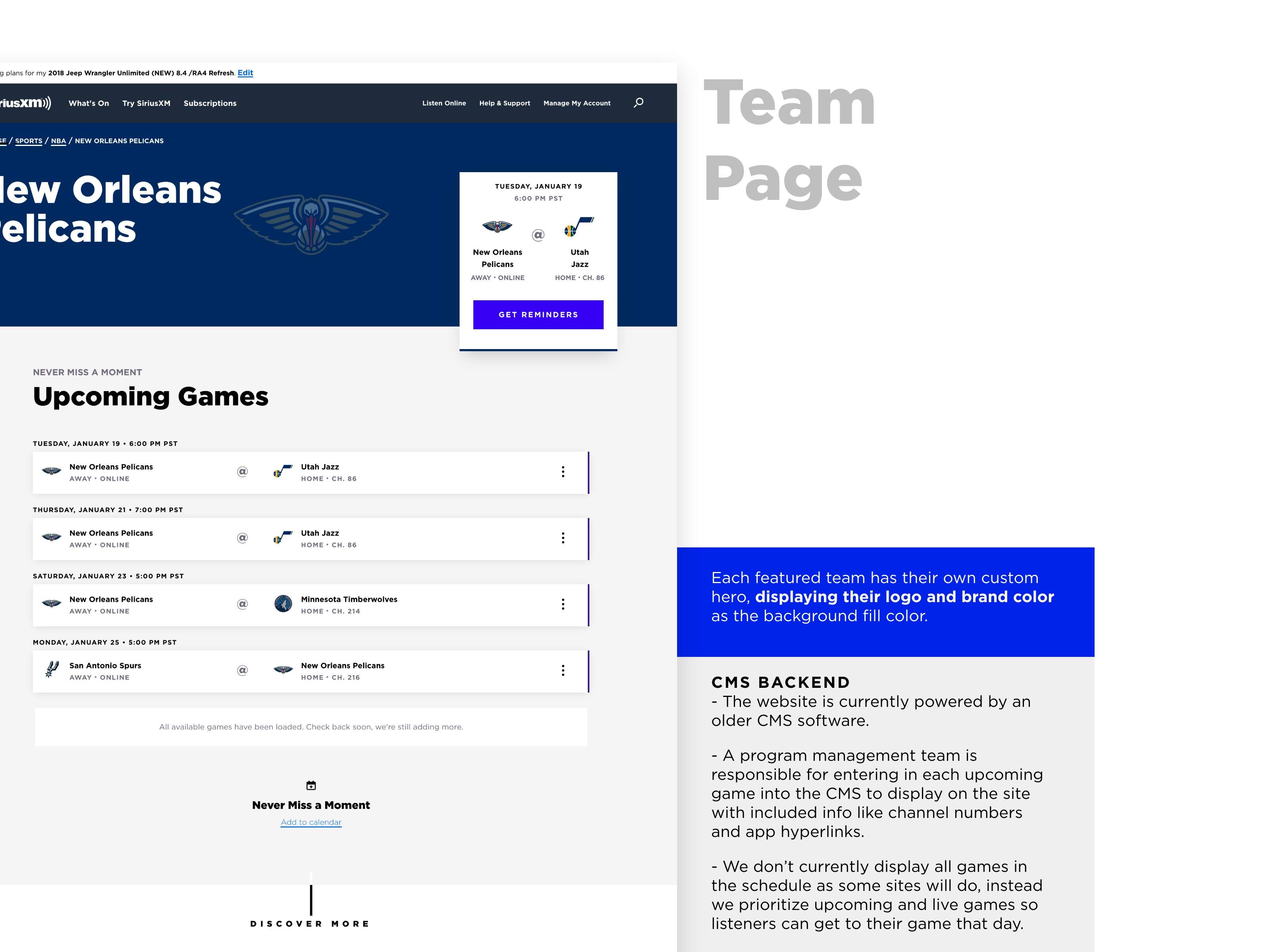
SiriusXM Sports
Role / Responsbility
StrategyResearchUser TestingUX DesignInteraction DesignTools
Adobe XD, Sketch, Invision, Jira
2020 - 2021 -
-
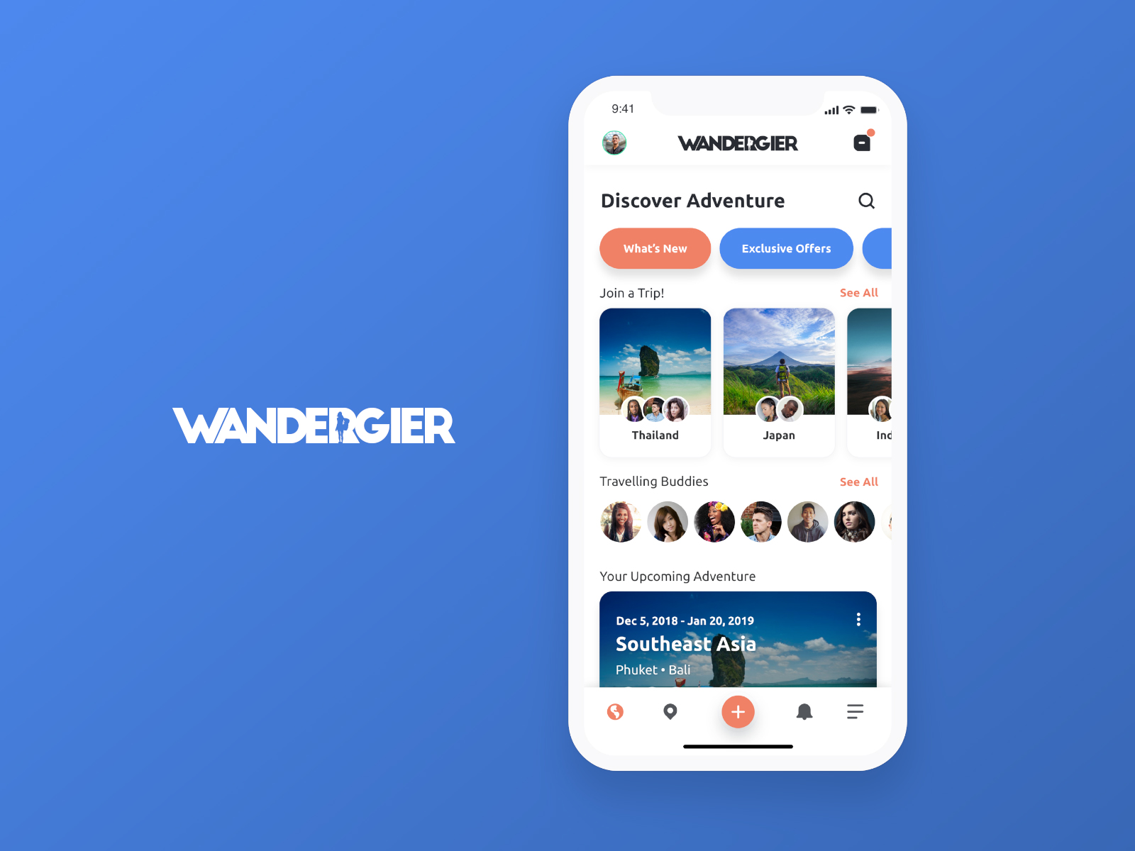
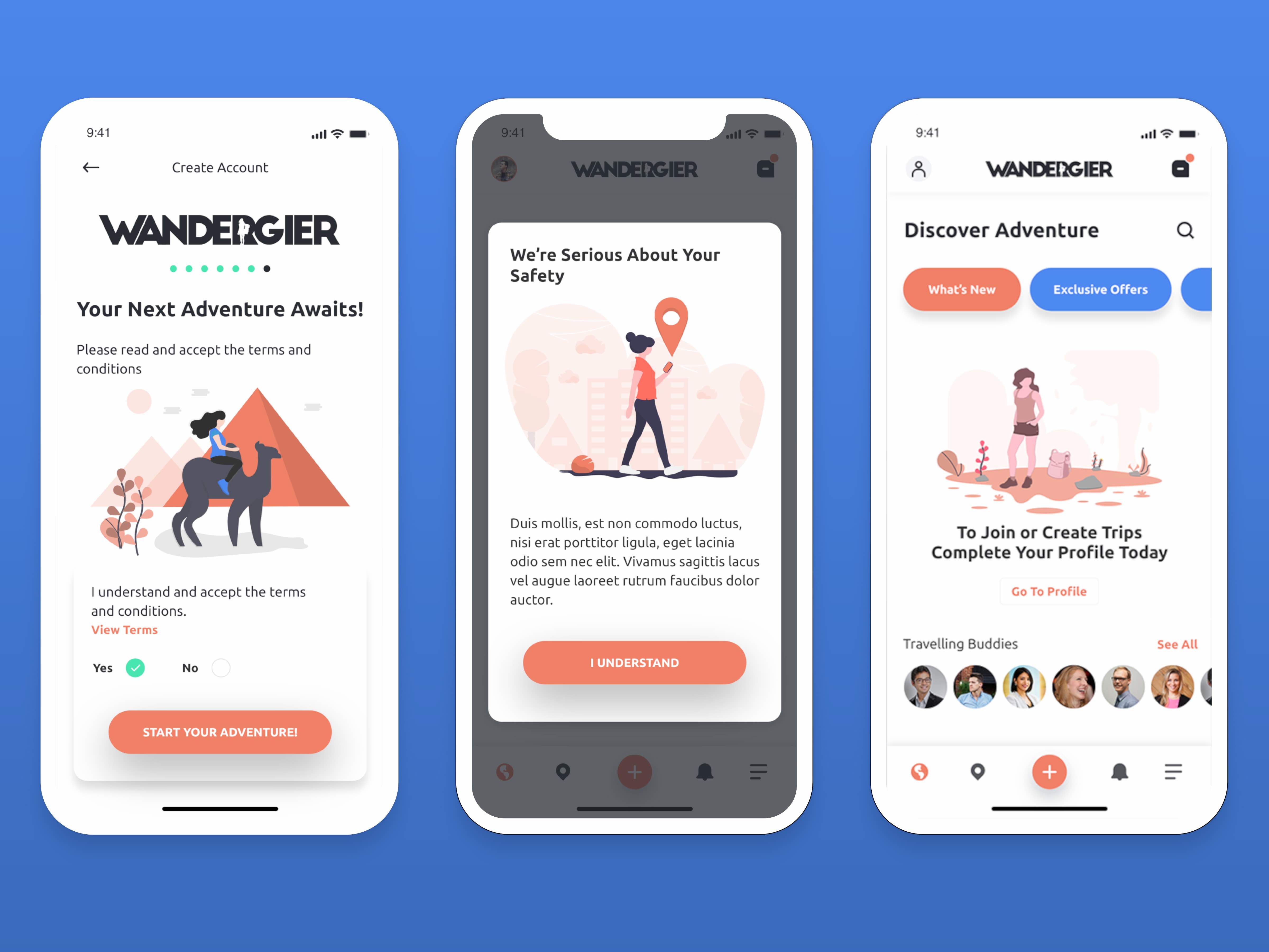
Wandergier
Role / Responsbility
UI DesignUX DesignResearchUser TestingStrategyVisual DesignTools
Adobe XD, Invision, Trello
Story
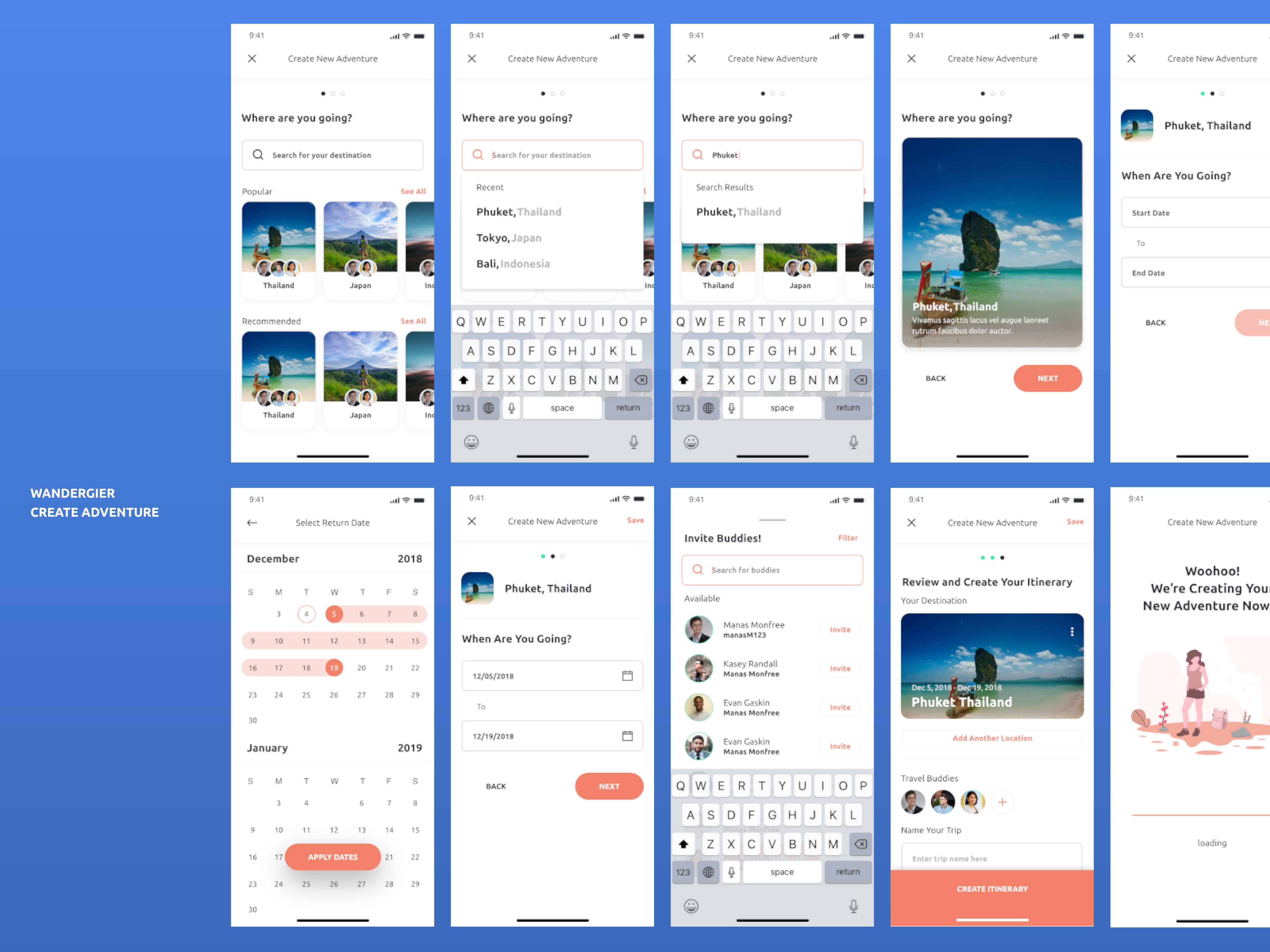
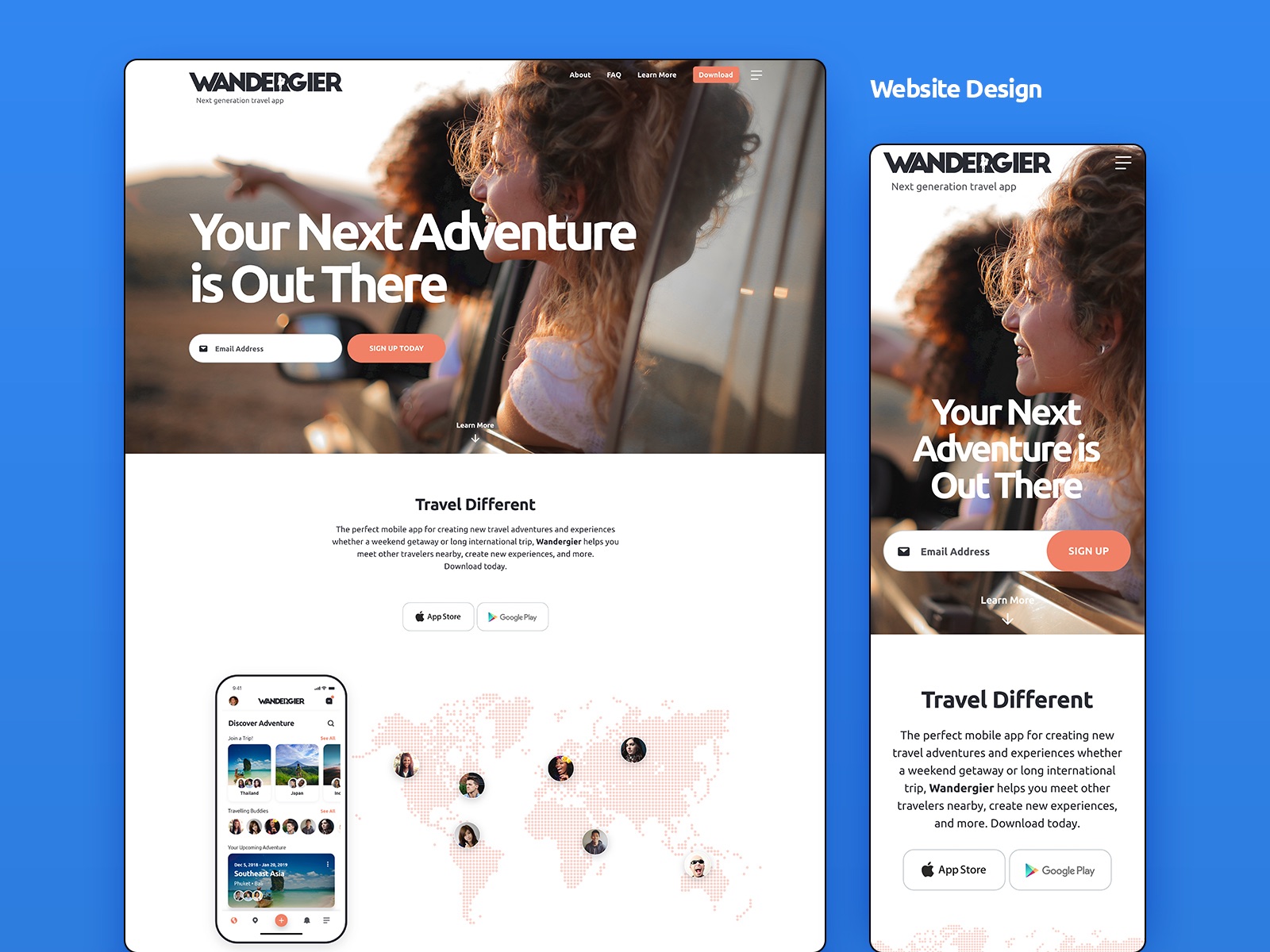
The client found me through Instagram and said they were very impressed with my work and wanted me to take their website designs to the next level for mobile.
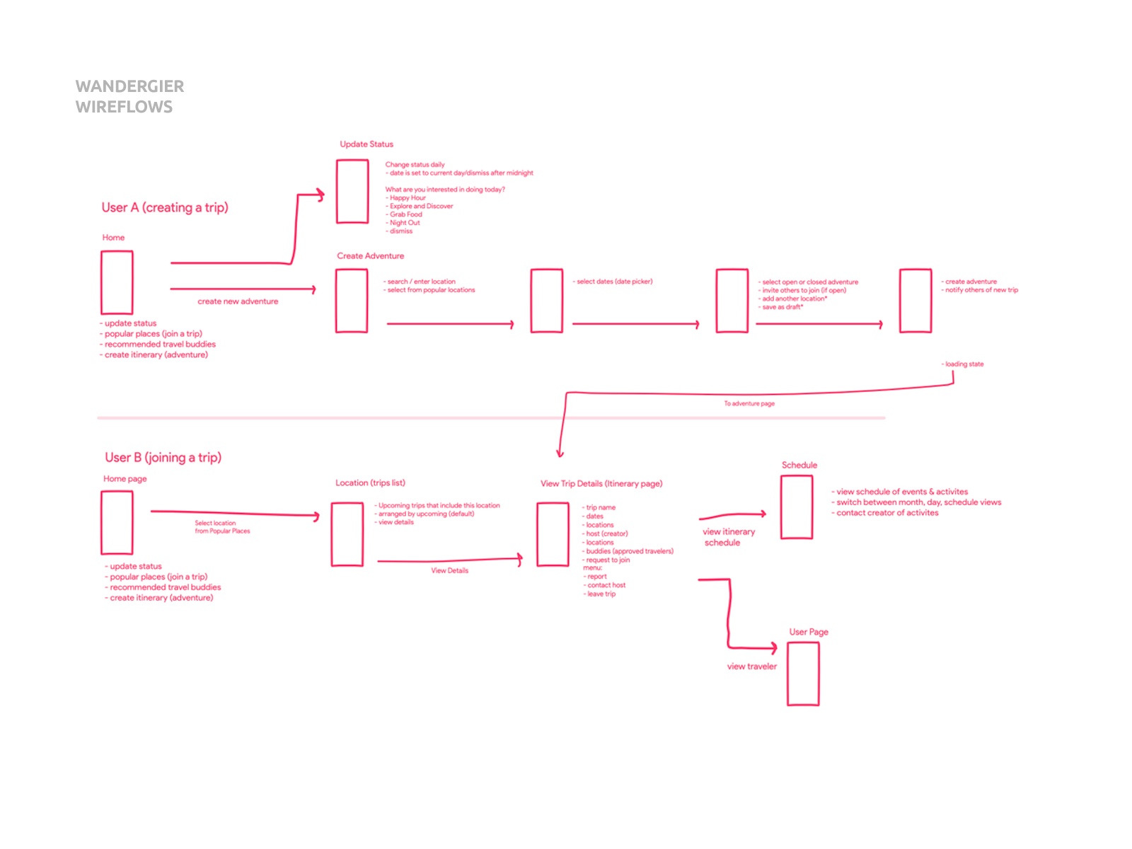
Initially, I worked within a tight budget and utilized familiar UI affordances, common mental models and created an action-driven experience allowing the user to have more control. I was able to experiment and gain valuable user feedback quickly through guerrilla testing.
For the first round of delivery I provided over 120 screens including every detail from all scenarios. The client asked me to become a partner and now I find myself as a board member overseeing the app development & design, user testing, feature updates, product roadmap, and more.
Impact
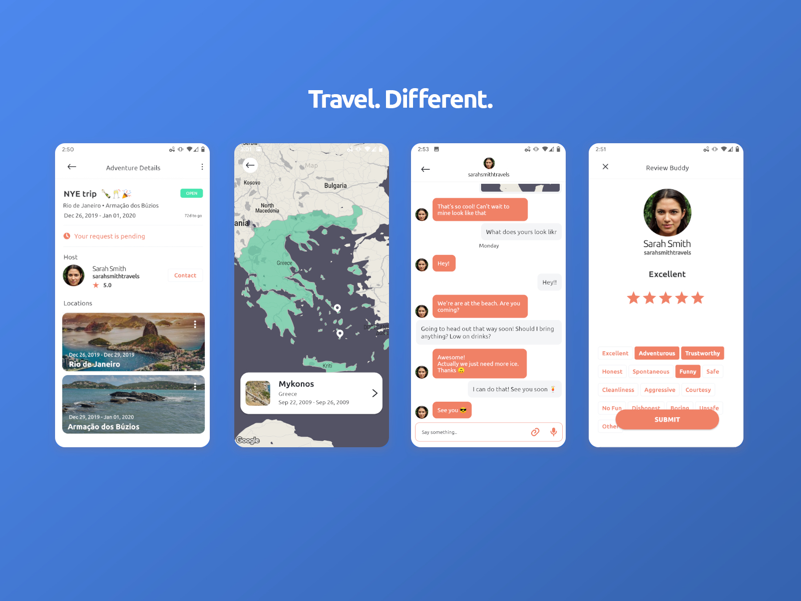
Wandergier just recently launched in October 2020! On both iOS and Android, Wandergier provides travelers a safe way to explore, meet new friends, share memorable experiences, and more.
2019 - Present -
-
Knowledge to Practice • CurrentMD
Role / Responsbility
UX DesignUI DesignResearchProduct DesignMobile DesignData VisualizationTools
Adobe XD, Invision Freehand, Jira
Story
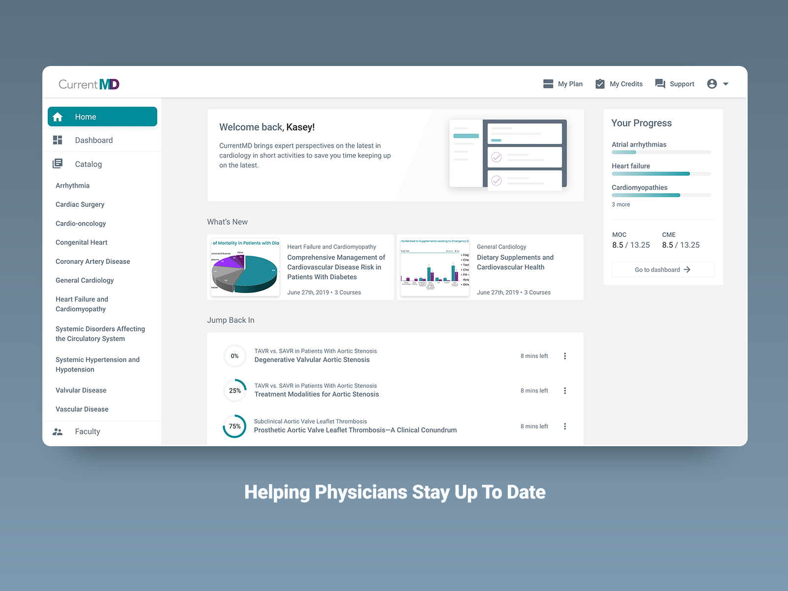
Knowledge to Practice and their product, Current MD (above) is a game-changing software in the medical industry helping Physicians and Doctors stay up to date with their continuing medical education credits.
Goal
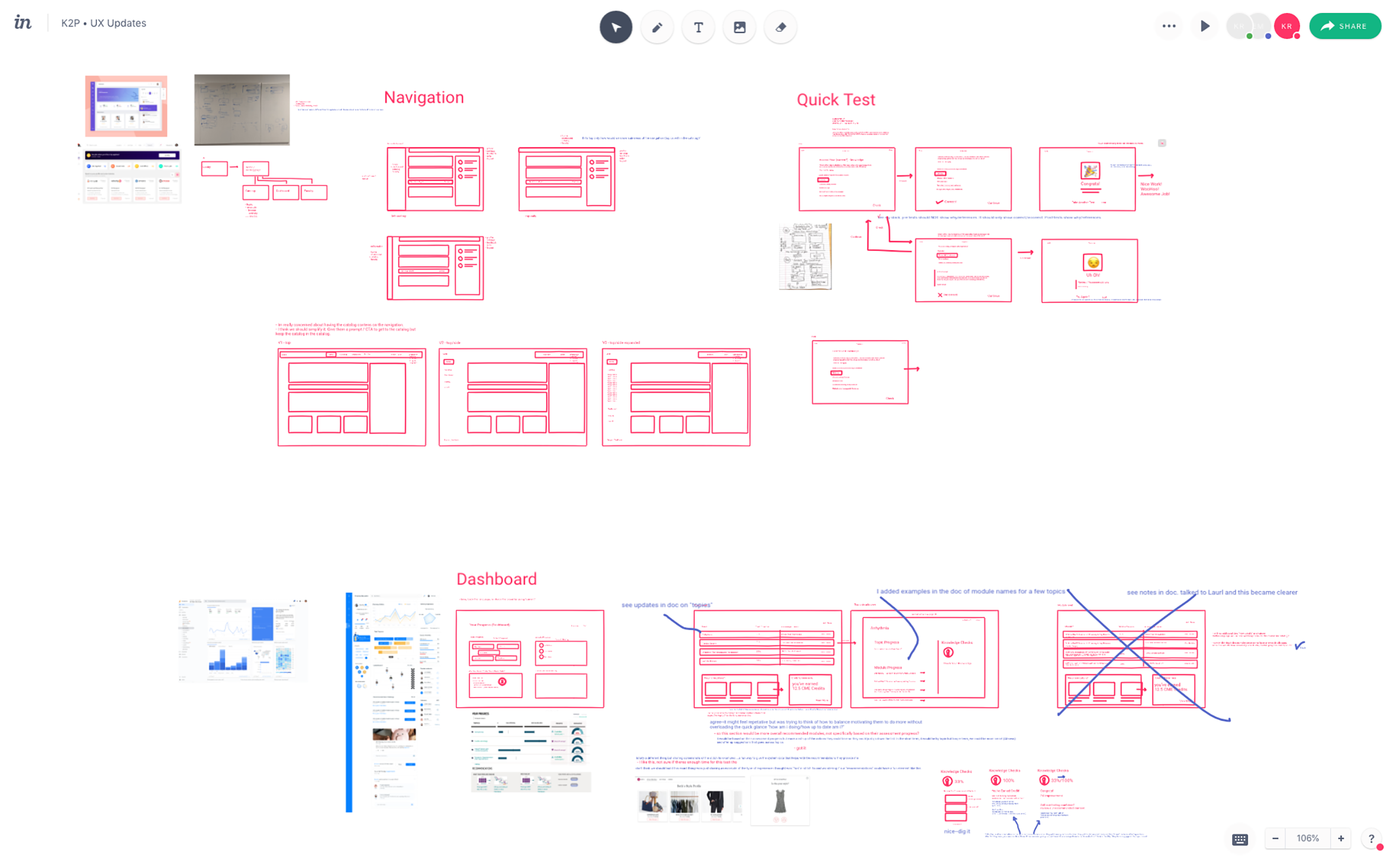
This was first Toptal engagement. I kicked it off as I would with any project and that's with an immediate deep dive to better understand the user problems, the business goals, and the software. I do this mainly by asking questions and taking lots of notes. I worked with stakeholers to review prior user feedback, gain insights, and discuss business goals set to achieve.
Impact
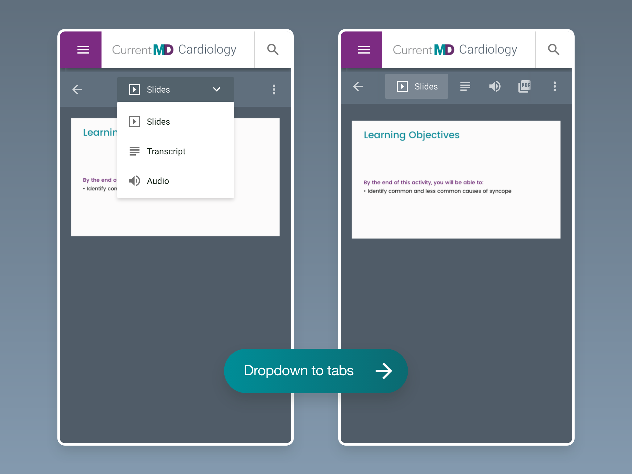
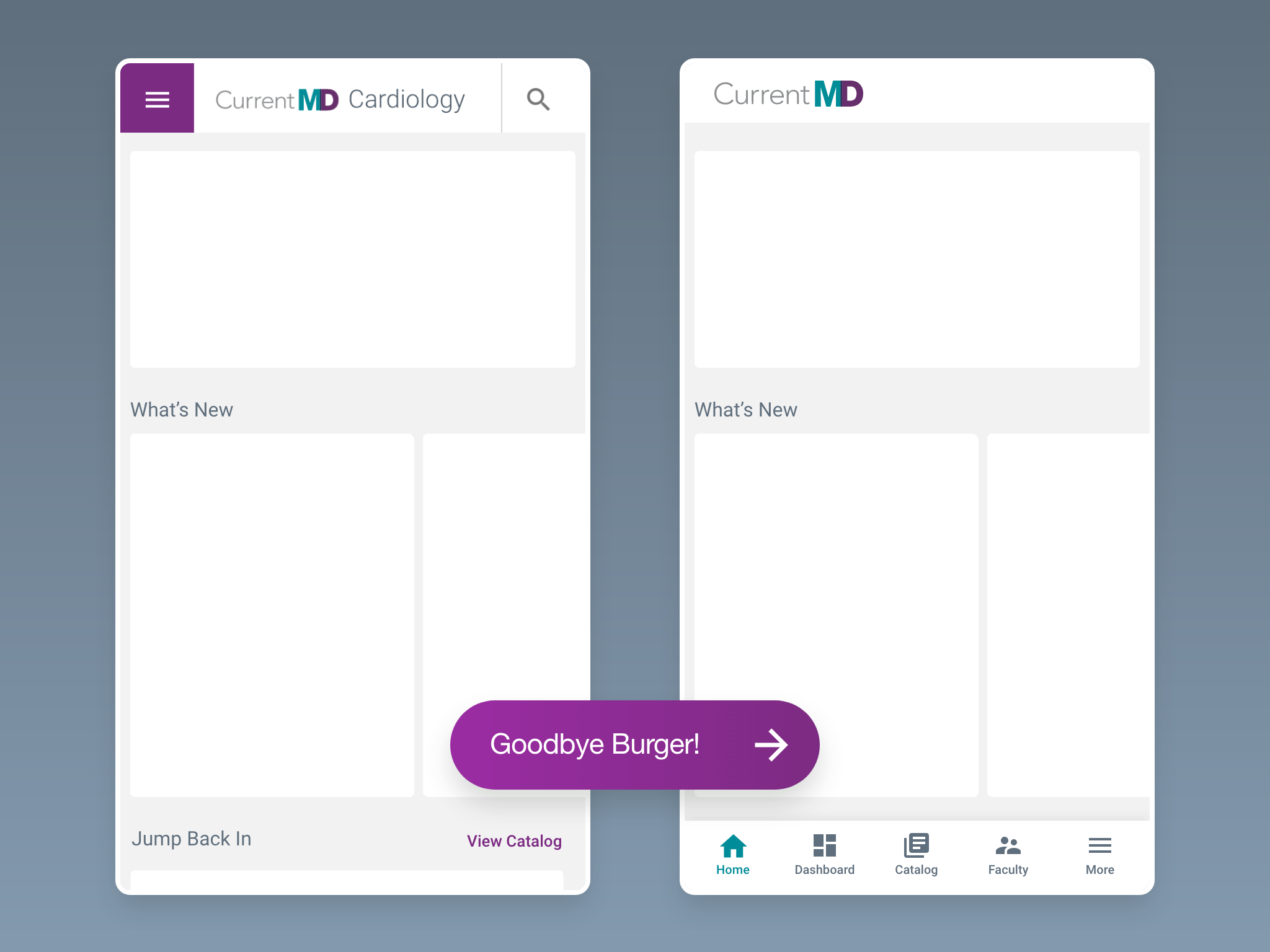
I worked directly with the Director of Product and VP of Engineering and was responsible for helping improve the overall user experience across web and mobile by way of ideation, user testing, and delievery of solutions and specs to development. Team members leaned on me for my UX and interaction design experience and knowledge.
By the end of my contract we were able to provide K2P's users a more focused product experience by creating, testing, and implementing highly requested features and updates. We wanted Doctor's to be able to continue their education "on the go" and not get in the way of their busy schedules. They're now able to view and manage their progress through a new, data-focused dashboard, and complete their courses through a redesigned wizard (mockups coming soon).
2019-2020 -
-
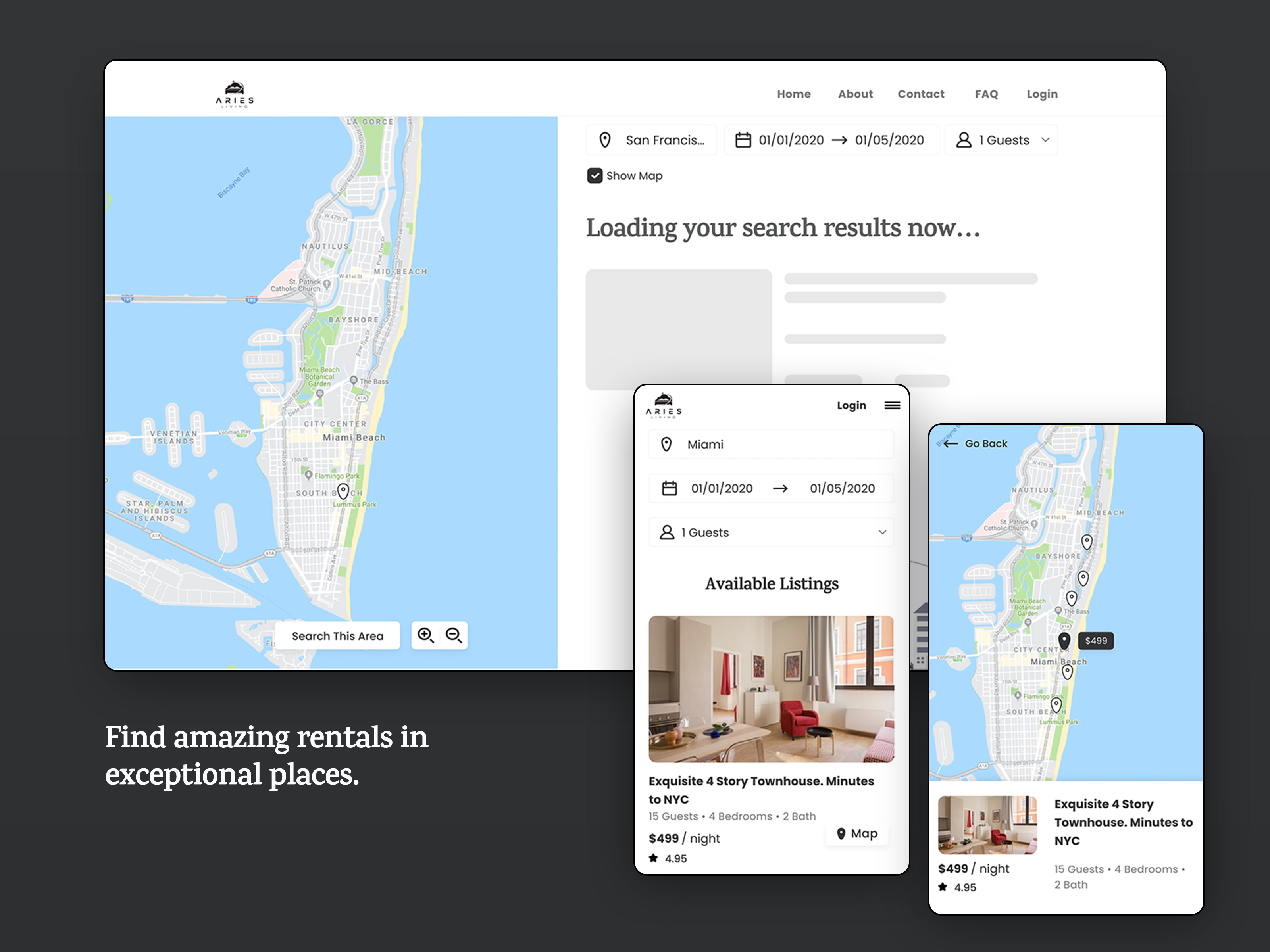
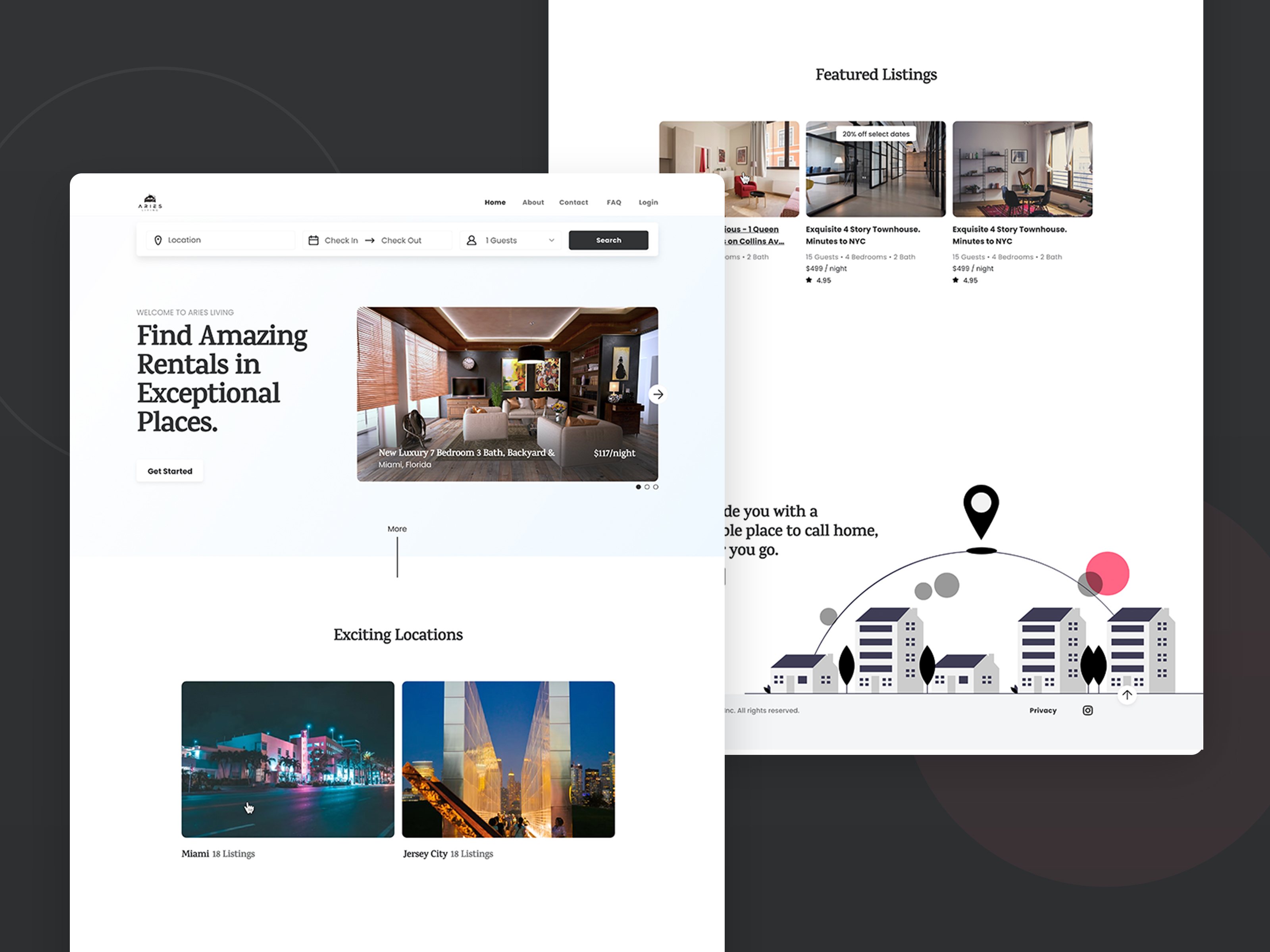
Aries Living
Role / Responsbility
Design LeadWeb DesignUX/UI DesignAnalysisStrategyTools
Adobe XD
Goal
Under a tight timeframe, I set out to redesign this website experience from the ground up and created a simple, yet familiar user interface. I wanted to create an experience that helped users explore and book rentals quicker and much easier – which in turn made the client happier.
Impact
I set out to help the client redesign their website and deliver a simple user experience utilizing familiar patterns and affordances found in the wild. I was able to do so. Since then, the website has kept the aesthetic I created and pivoted their business model, and in doing so have changed quite a bit of their website design with it.
2019 - 2020 -
-
S1 (Unofficial Title)
UX DesignUI DesignResearchWeb App DesignSoftwareDesign SystemData VisualizationTools
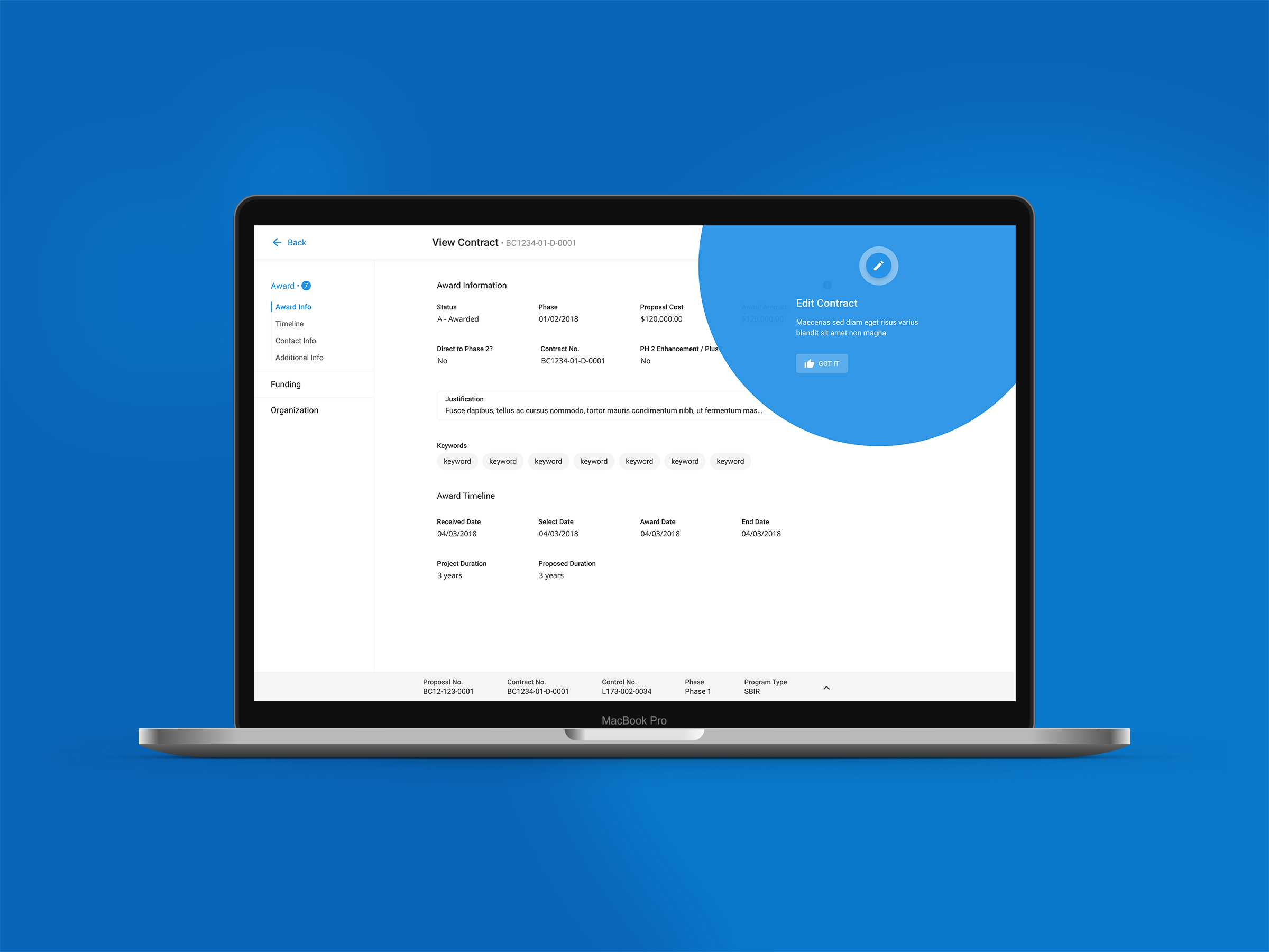
Adobe XD, Invision, Miro (Real Time Board), Lucid Chart, JiraStory
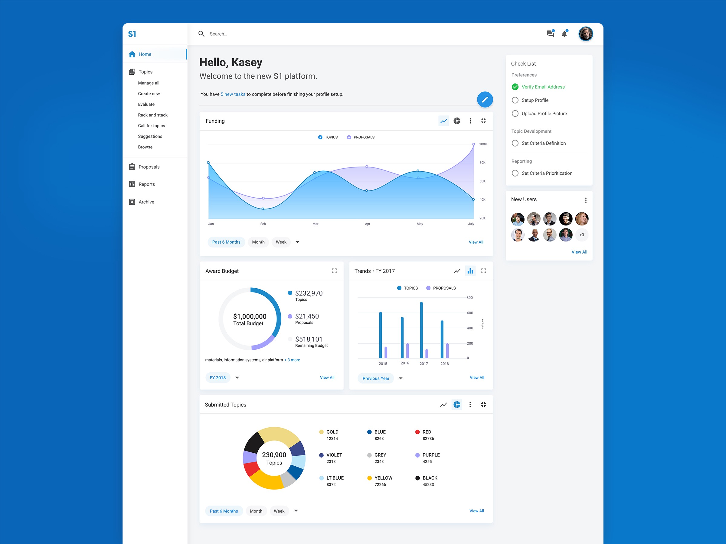
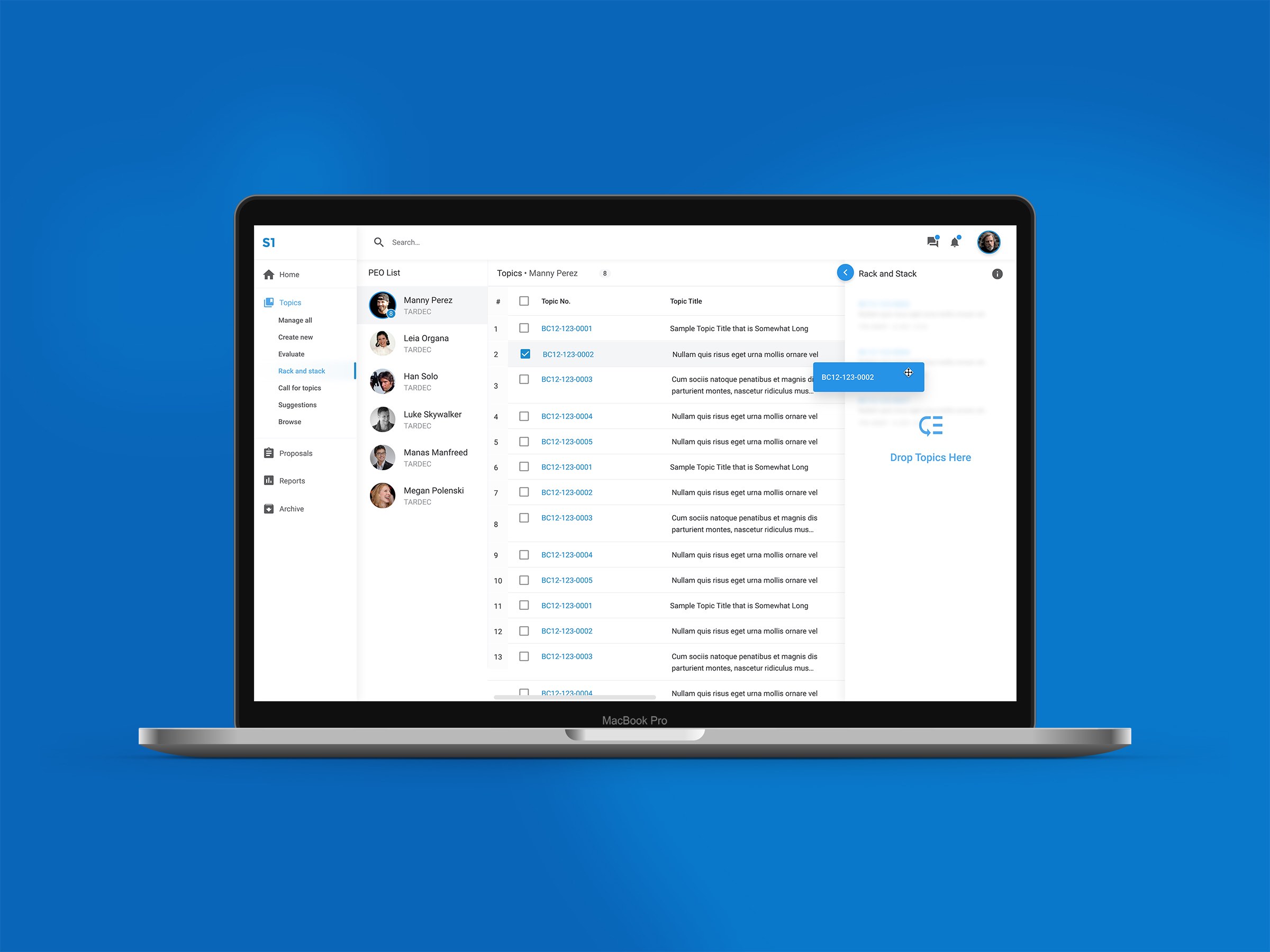
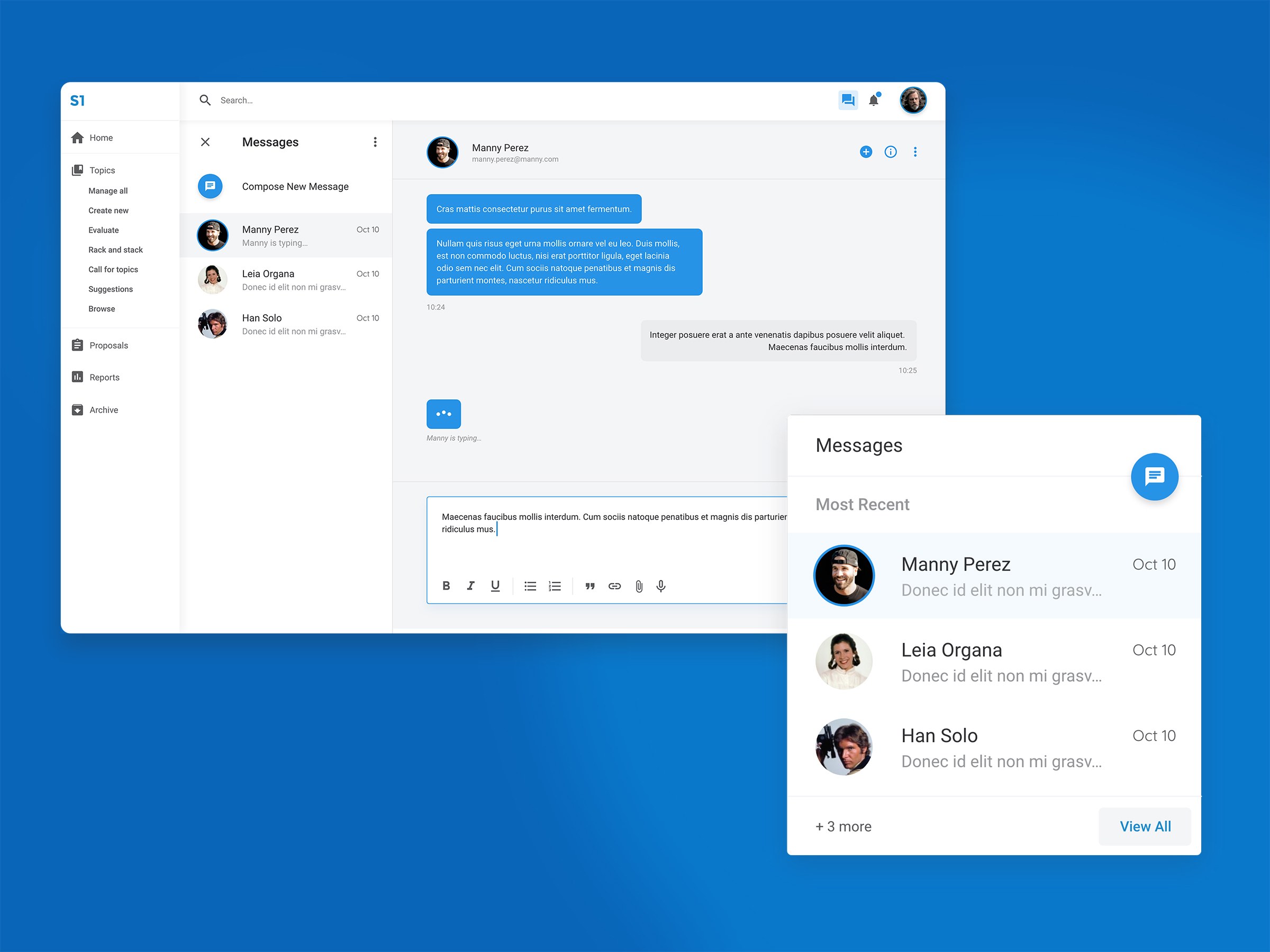
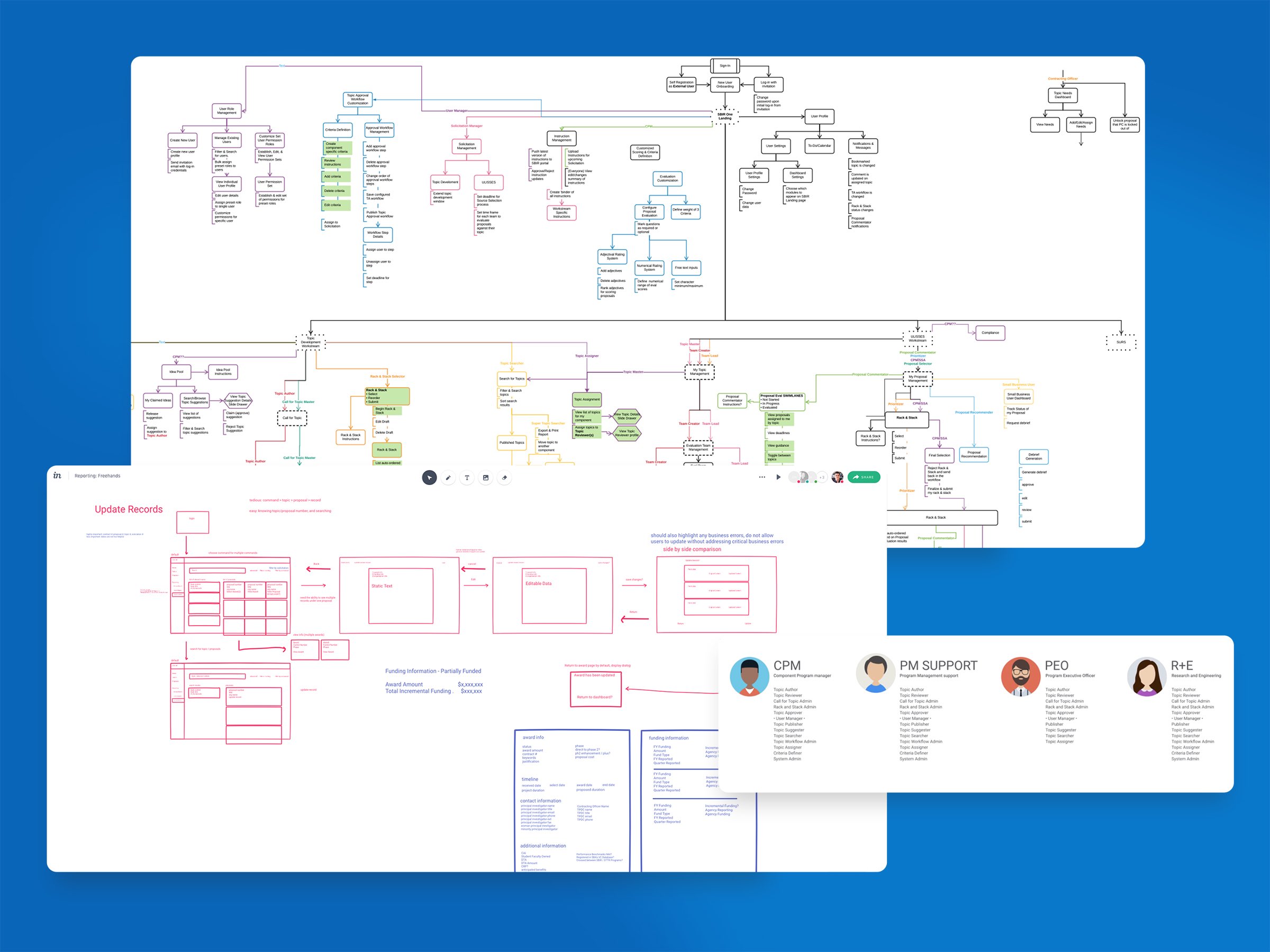
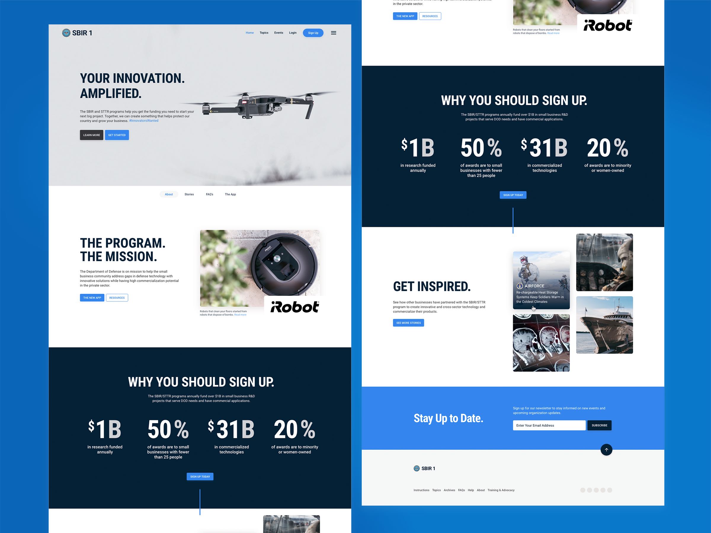
S1 (unofficial title) is a custom, state of the art and brand new web platform to replace outdated processes for government, small businesses, and academia alike to create, maintain, and build innovative technologies. Those technologies developed in the past using this process include Velcro, aerial drones, and even Lasik eye surgery.
Challenge
This large platform brings together 4 different applications in one place for program managers to manage all team's processes for topic development, proposal selection and awarding funds.
Goal
The goal was to create an intuitive experience with a friendly visual language, utilize a single sign-on application that would tailor itself to your access permissions. We wanted to create a familiar, guiding experience to increase engagement and retention while decreasing thousands of hours wasted on those tedious, outdated processes.
2017 - 2019 -
-
Align Mobile App
User ResearchUX DesignUI DesignMobile AppTools
Adobe XD, Invision, Jira, HTML5, CSS3, Kendo-UI
About
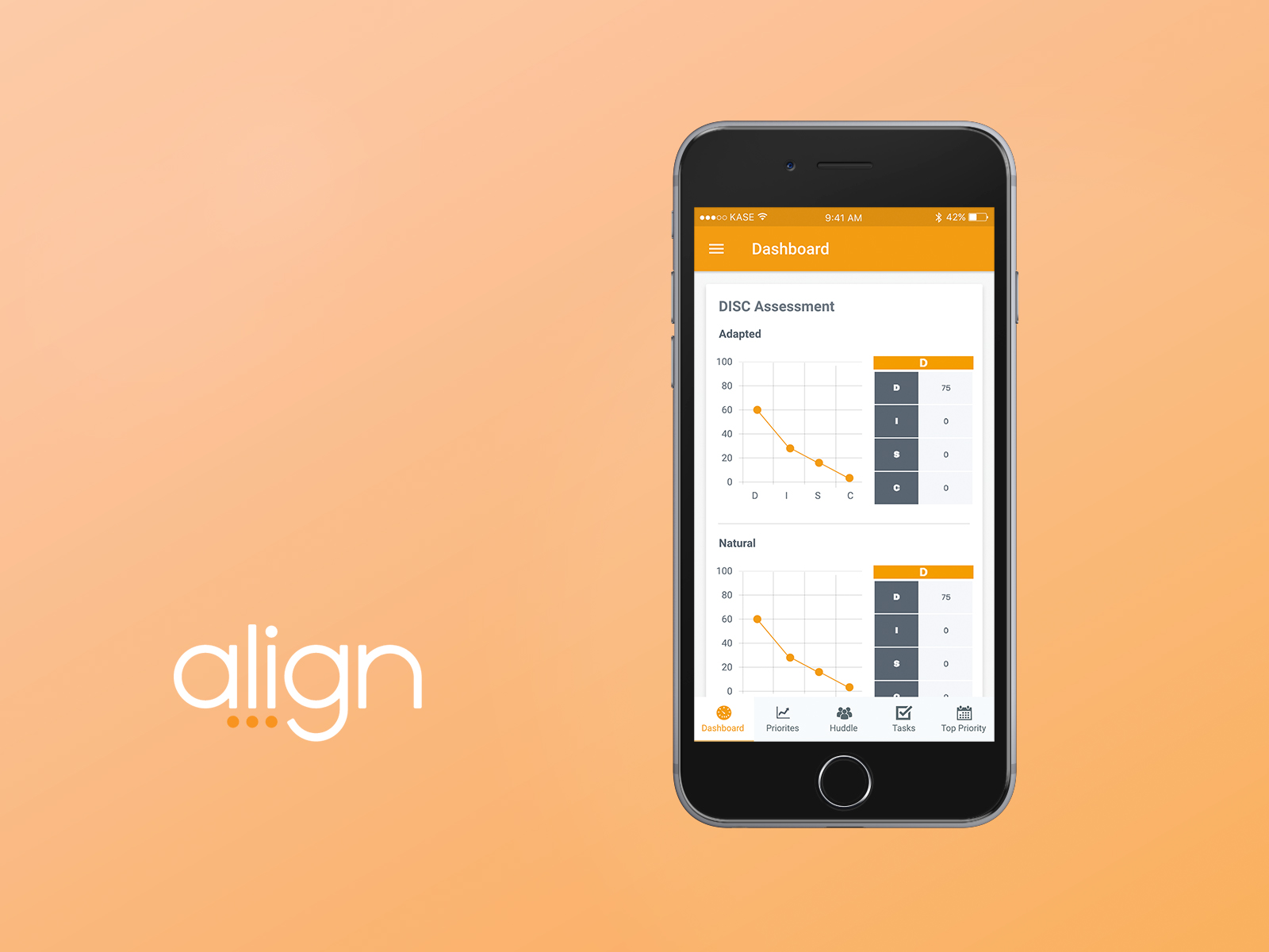
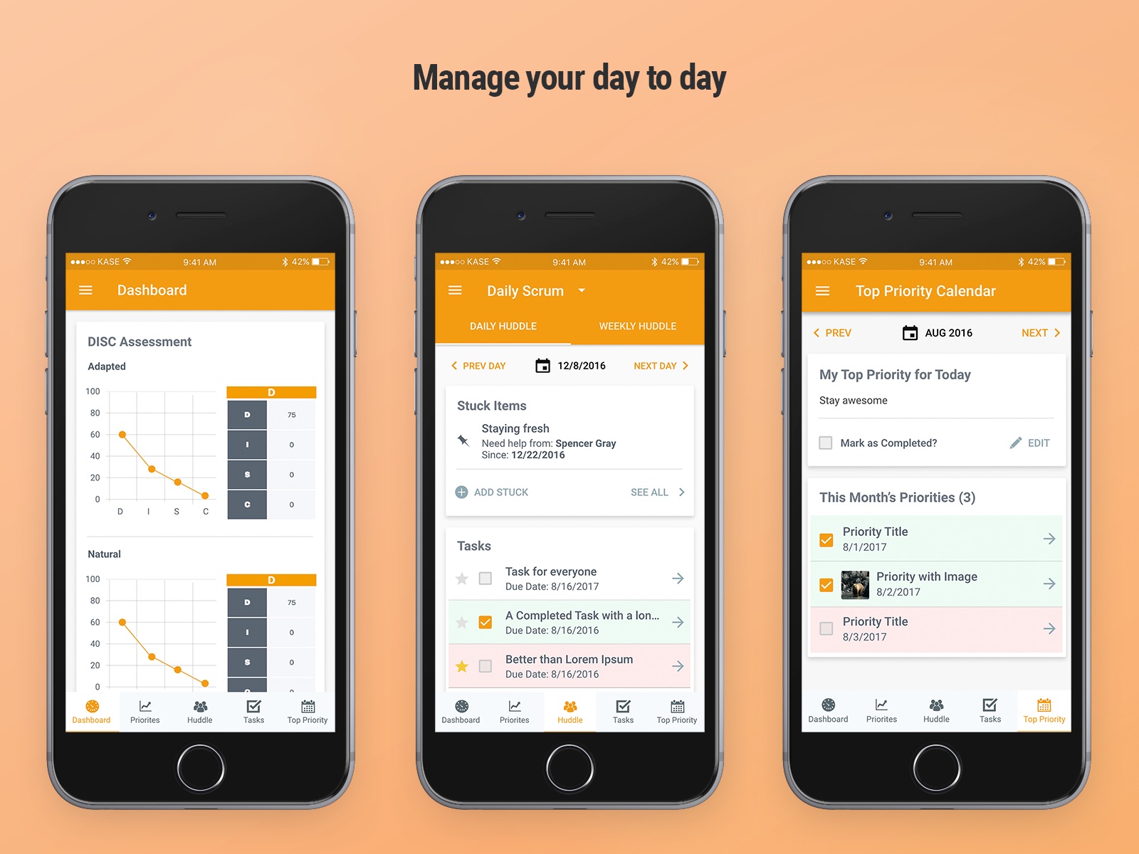
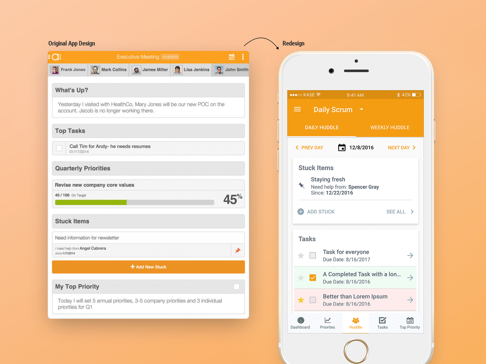
Align is a cloud based business operating system designed to keep businesses and business leaders on the path to executing their plans.
Goal
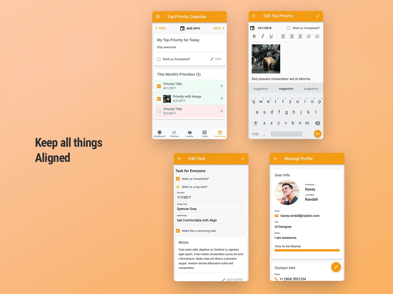
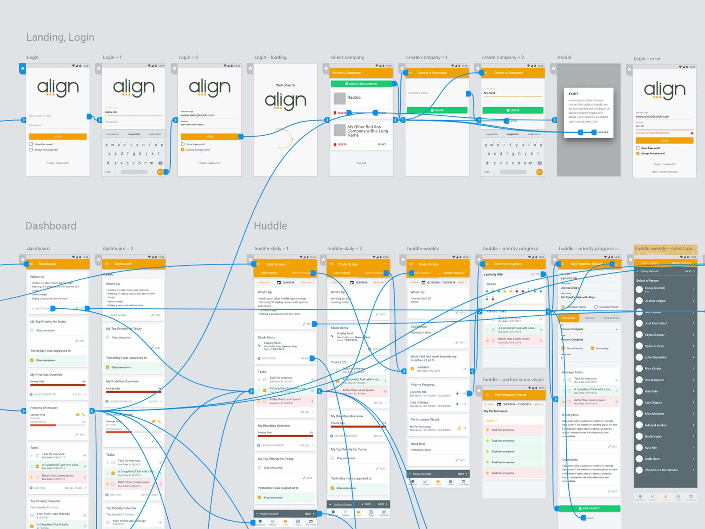
For my final project at Radolo I was tasked to provide solid redesign of Align mobile with solutions to their many problems. Gut the fat. Simplify navigation. Create a better experience overall while bringing visual design to top priority.
Process
I worked with the client to create a more engaging way to achieve goals, manage tasks and team, share insights, and provide real-time data. The prior app was outdated in look and feel, and functionality.
Through user feedback I found opportunities to create a more focused approach and easing recurring frustrations.
Challenges
30 days to complete. No budget for user testing. New software Adobe XD.
2016 -
-
Aptify Association Management Software
UX DesignUI DesignWeb AppMobile AppData VisualizationTools
Adobe Illustrator, Invision, Jira, HTML5, CSS3, Kendo-UI
Story
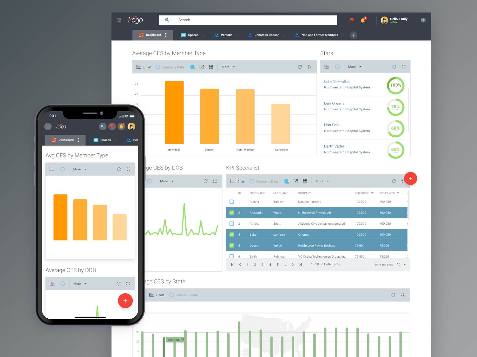
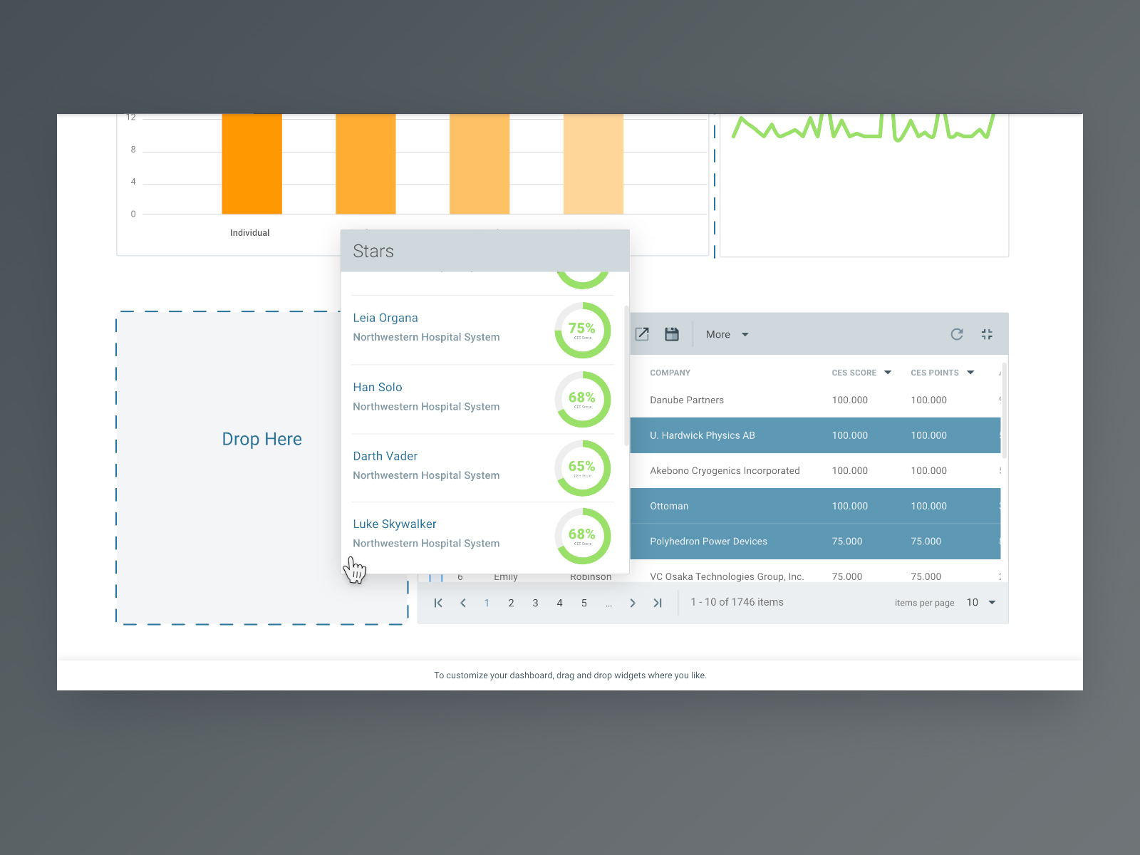
Aptify's Association Membership Manager was a brand new software platform that was meant to adapt to the customers' needs as their association grows over time. This new software was intended to empower users and make managing their data, members, and campaigns easier.
I managed and led product design and user experience initiatives across the product lifetime. With little-to-no research budget and using best practices, I worked closely with the project manager to balance business goals and make decisions to create a good user experience.
2015 - 2017 -
-

Design System + UI Library
Design SystemPattern LibraryTools
Adobe XD, stackblitz, github
Story
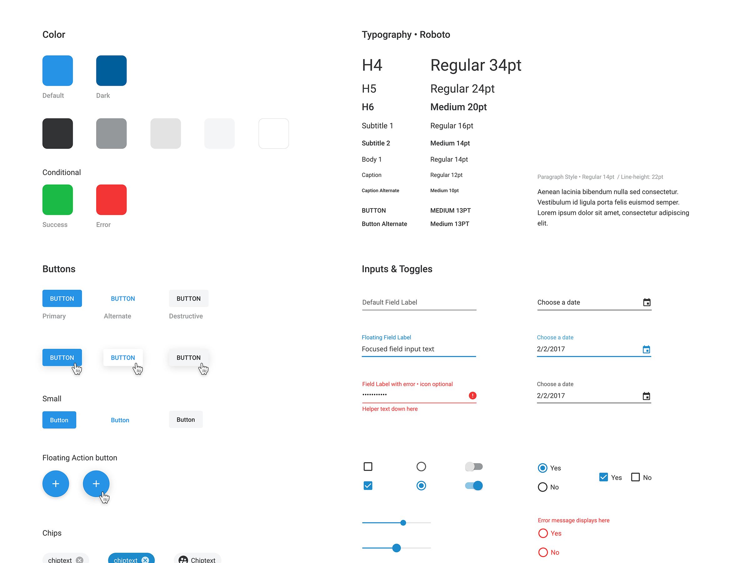
One of my intitial projects starting at ByteCubed was designing a intuitive library of UI assets that will propel our design process. Working with the small yet eager and passionate UX team, I was able to flesh out a living and, more importantly, adaptable kit that is inspired by Google's Material Design specs.
Goal
Create an comprehensive design system and pattern library to use for the current software project and future updates.
2017 -
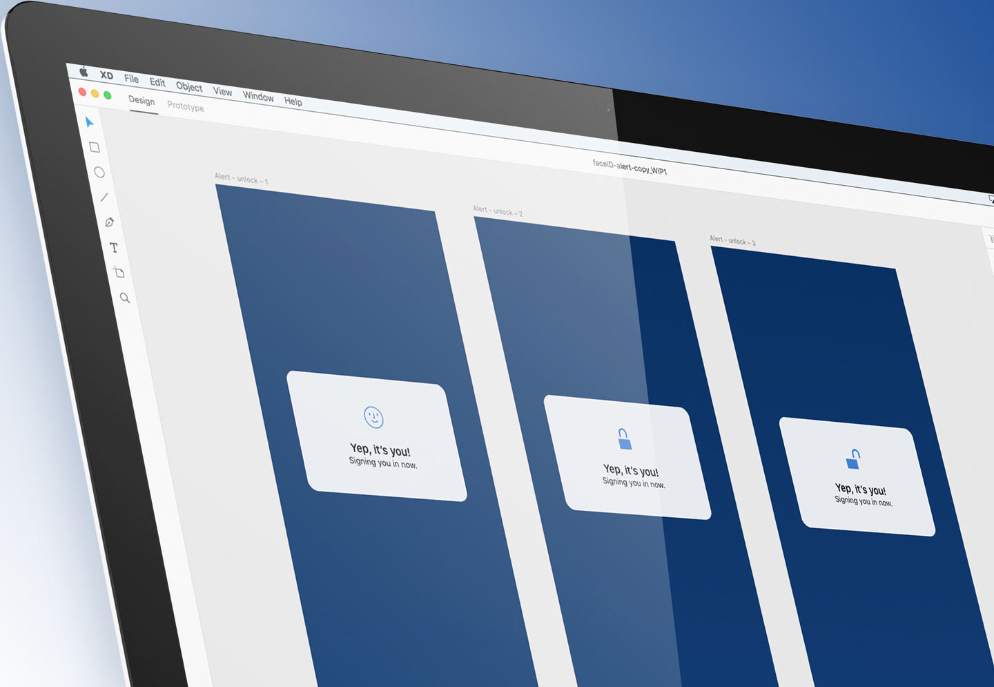
GEICO Mobile App Face ID
UX DesignUI DesignMobile App DesignMicro-InteractionsBiometricsTools
Adobe XD
Story
Working with new, cutting-edge technology like biometrics and facial recognition in the new iPhone X, I explored micro-interactions for logging in to GEICO's mobile app.
2017 -
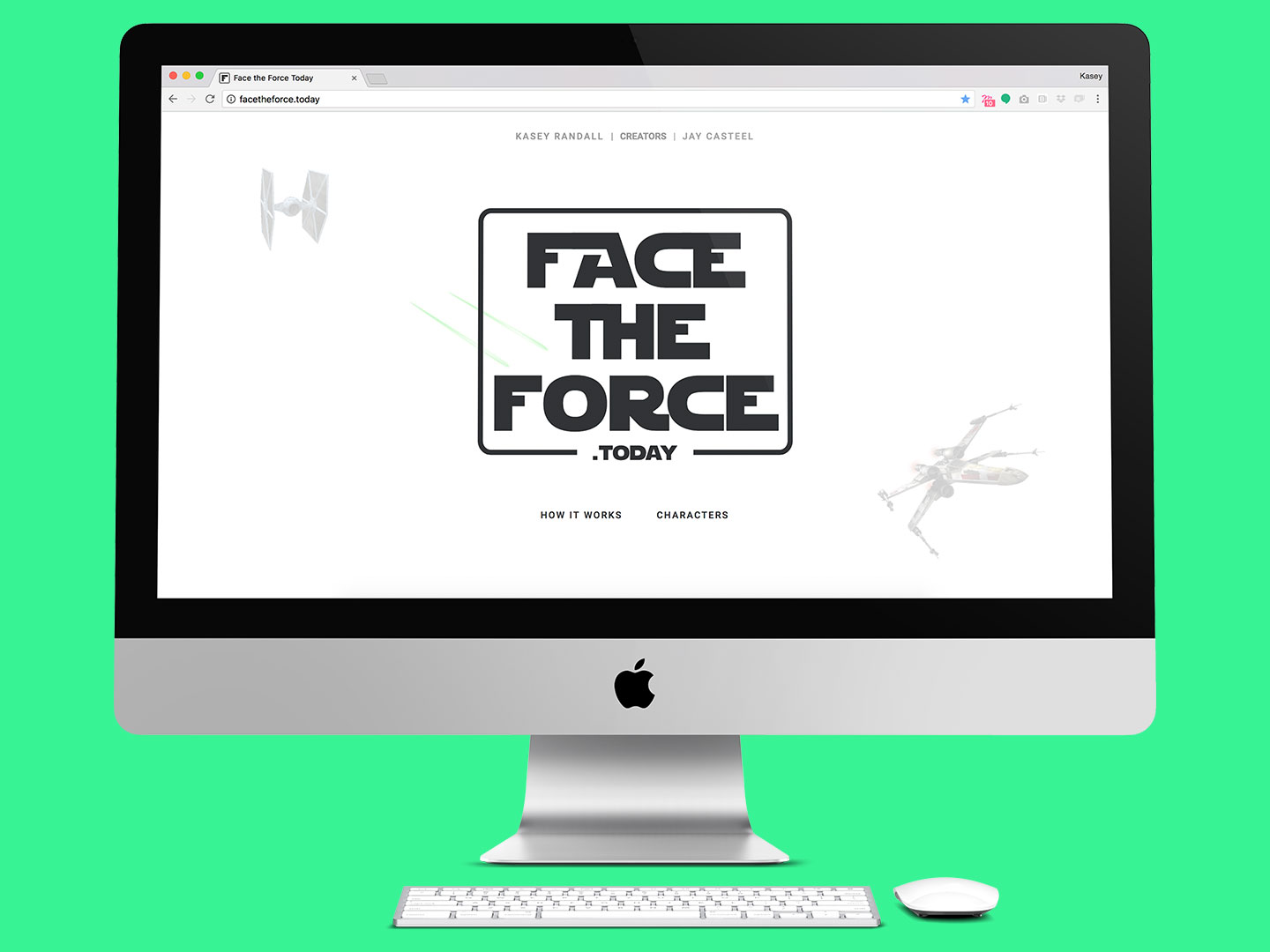
Face the Force Today
Website DesignUI DesignTools
Adobe Illustrator, HTML 5, CSS3, Javascript, PHP
Story
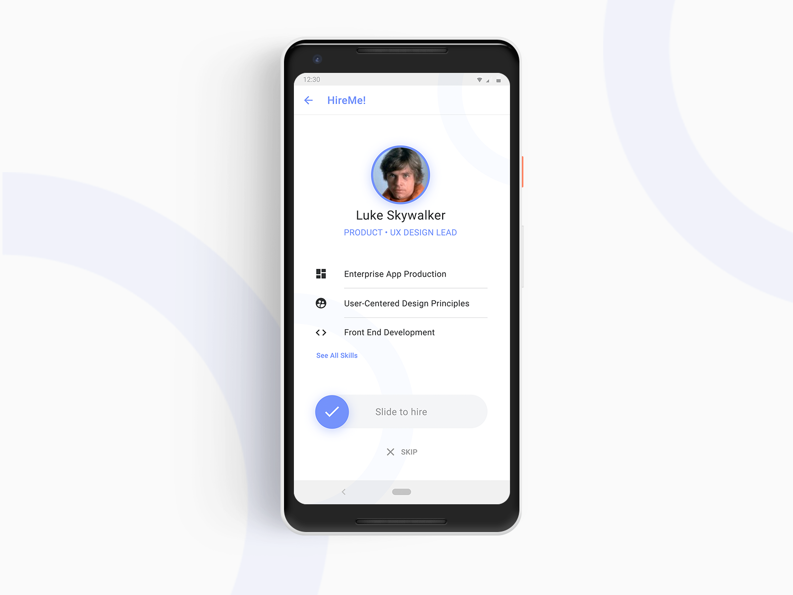
In honor of May the 4th (be with you), Jay Casteel and I sat down at a coffee shop one night after a few brainstorming sessions to design and build out our free service tool for designers and developers to use Star Wars character faces for their prototpyes and designs.
Challenge
Figuring out how to not recreate the same photo on the server every time one image is used. We wrote a bit of js and php to make that magic happen in the back end; once an image is created (whatever size) it would not be duplicated - only reused.
2016 - Present -
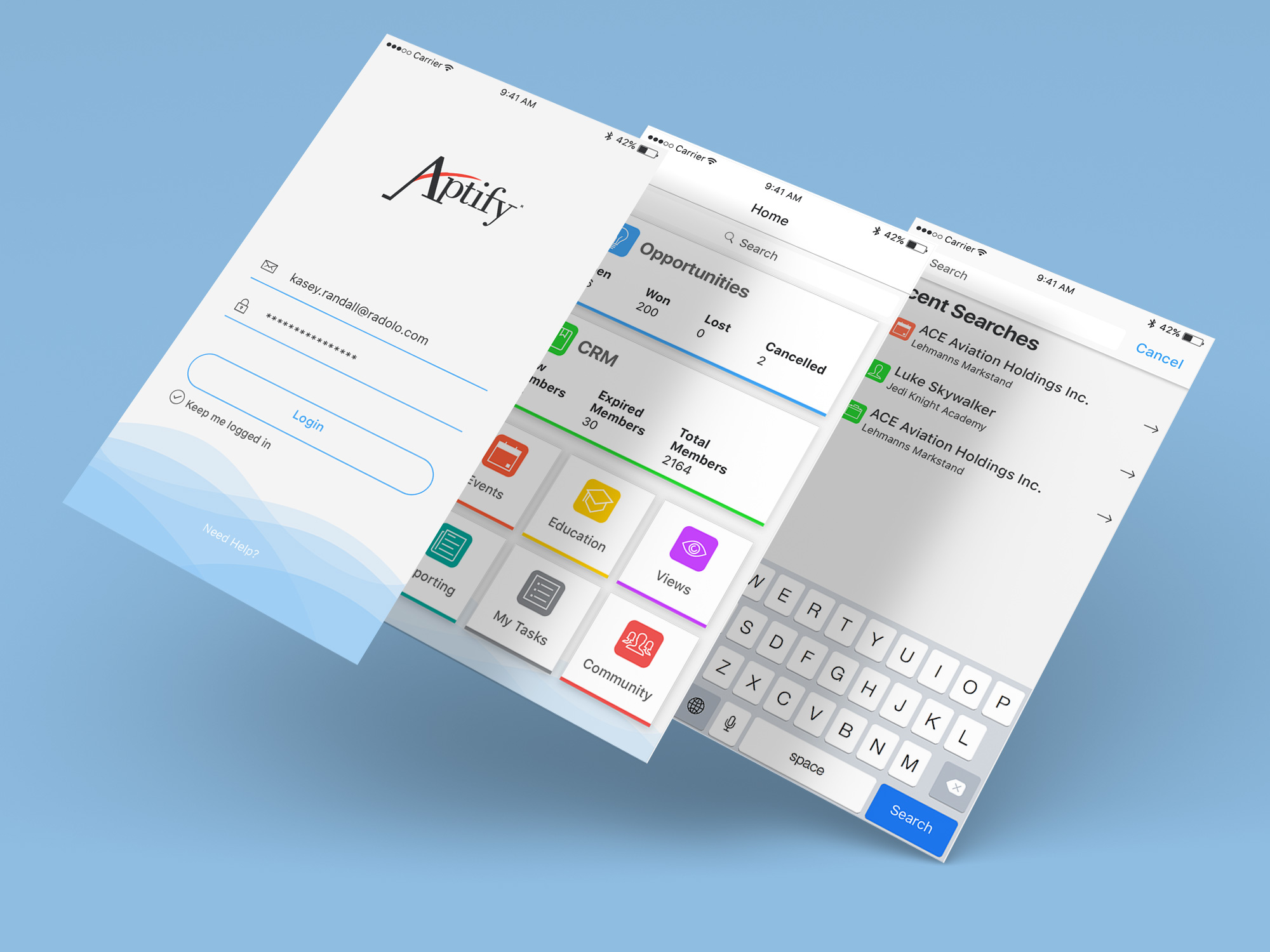
Aptify Mobile App
Mobile AppUX DesignUI DesignData VizualizationTools
Adobe Illustrator
Story
Designed with mobile in mind, I worked directly with Aptify's Product and Enginnering team to create a app powered by Salesforce.
Impact
We designed and built a place for Association's to quickly and easily make calls, email and make notes, capture, create and edit your member records in real-time. We strived to allow users to better focus on the data they need most when they want it.
2016 -
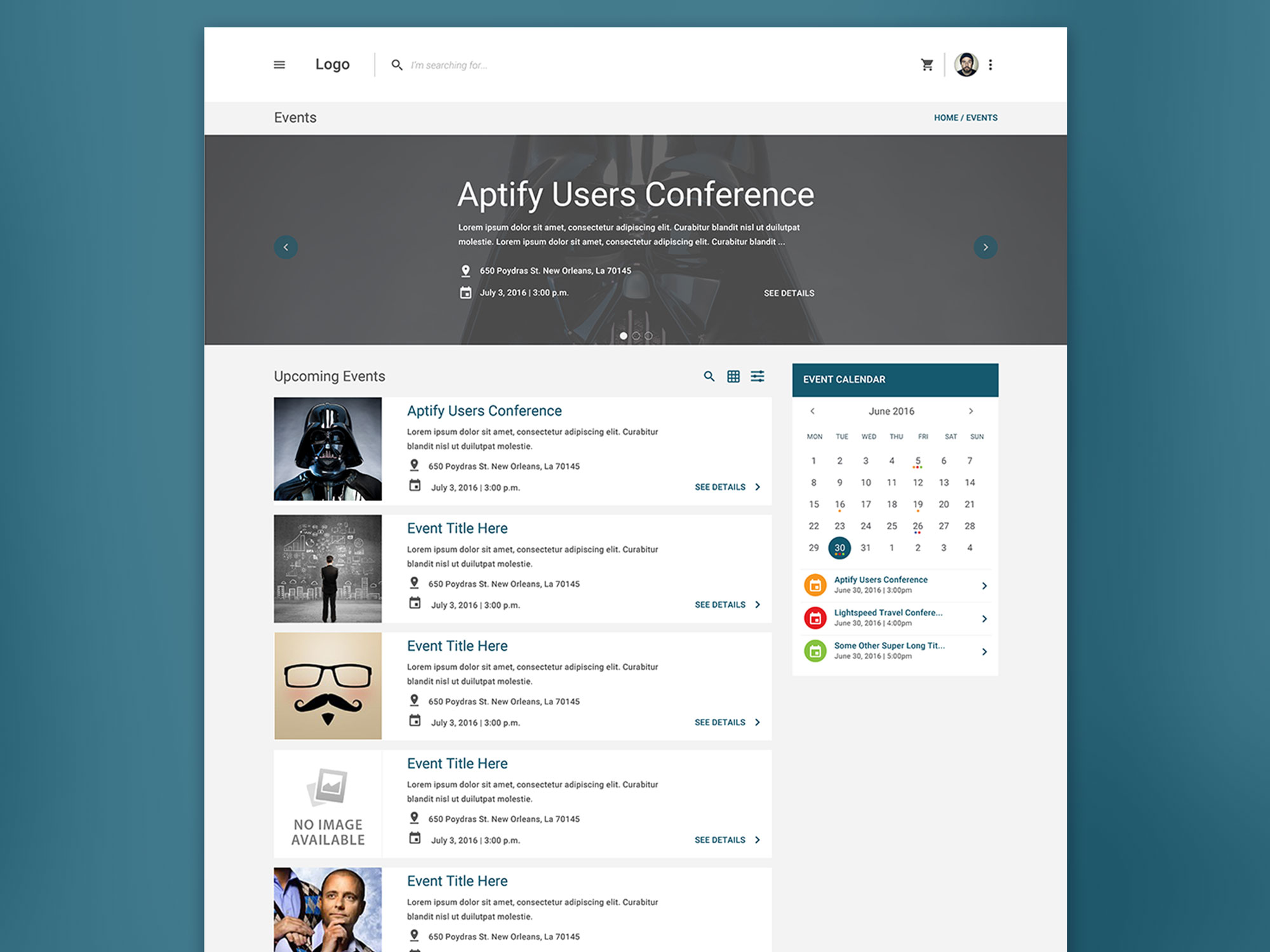
Aptify E-Business
Web AppMobile AppUX DesignUI DesignE-CommerceTools
Adobe Illustrator
Story
I worked directly with Aptify Product and Engineering team's to create an experience for Associations to create and manage their events, sell merchandise and more.
Impact
We gave Associations the ability to create and customize their own e-commerce websites to sell products and events while not only scaling in growth but also propelling their members into the 21st century.
2016 -
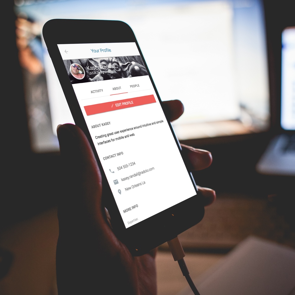
Rasa.io
Mobile AppUX DesignUI DesignTools
Adobe Illustrator, HTML5, CSS3, MDL
2015
-
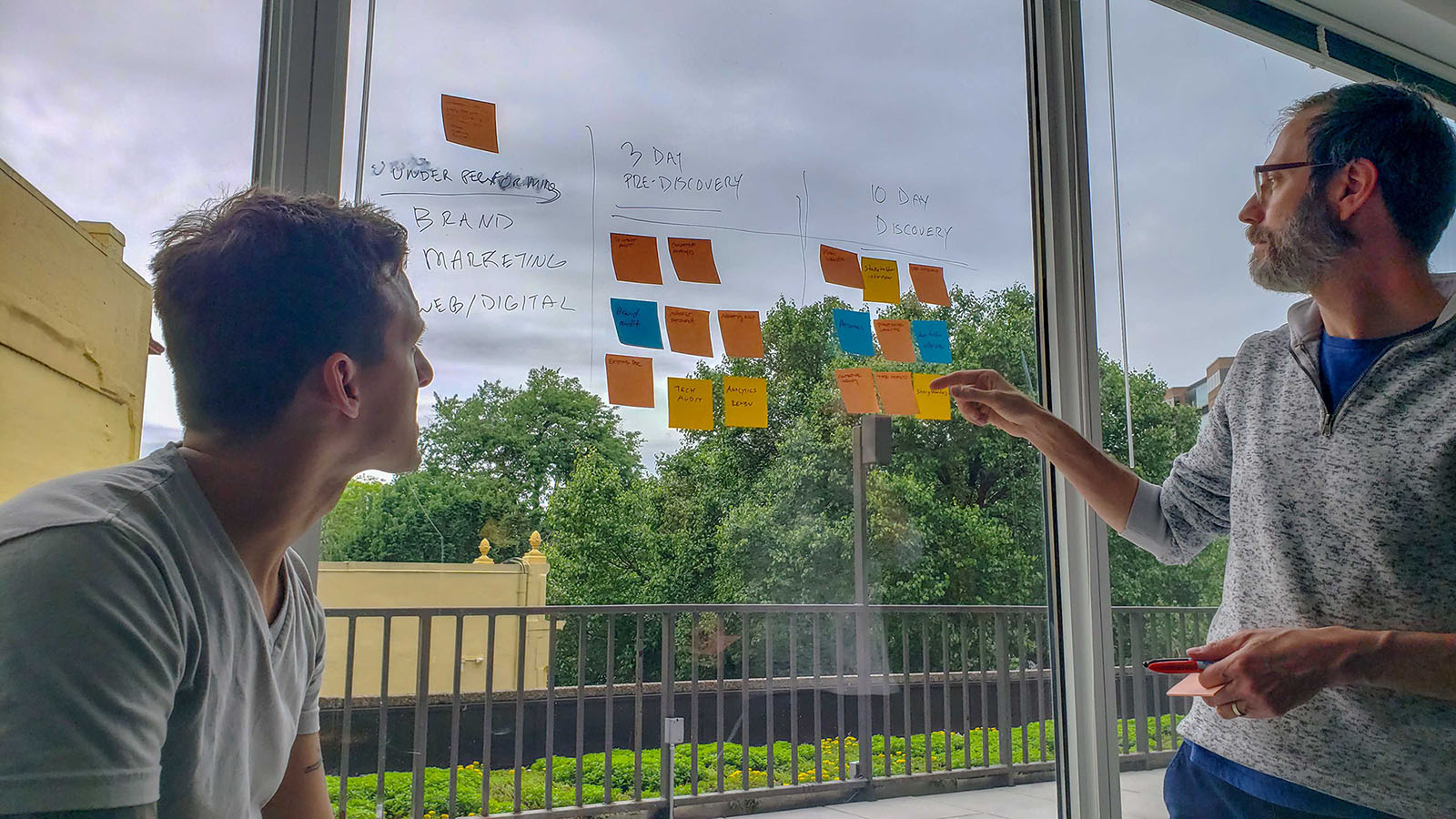
Examining the Discovery Process
ToolsUX ResearchDesign Strategy
Sticky notes, Pens, Windows, Brains Story
There is no "cookie-cutter" workflow for discovering the fundamentals problems user face or understanding business goals but there might be a more effecient way to determine the approach. 2019 -
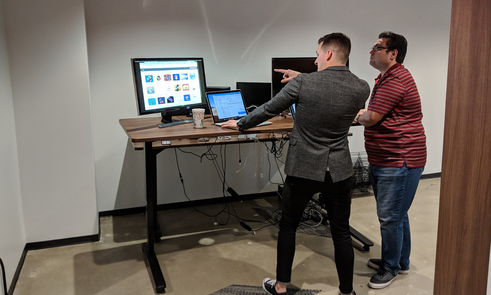
Mentoring UX Designers
2019UX Design -
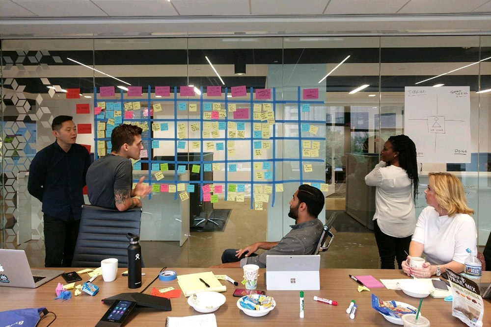
Journey Mapping
ToolsResearchStrategy
Tape, Post-it Notes, Markers Goal
To understand the user you must put yourself in their shoes. Being empathetic is critical to a designers ability to solve problems. It is then our job to create solutions to those problems. 2018 -
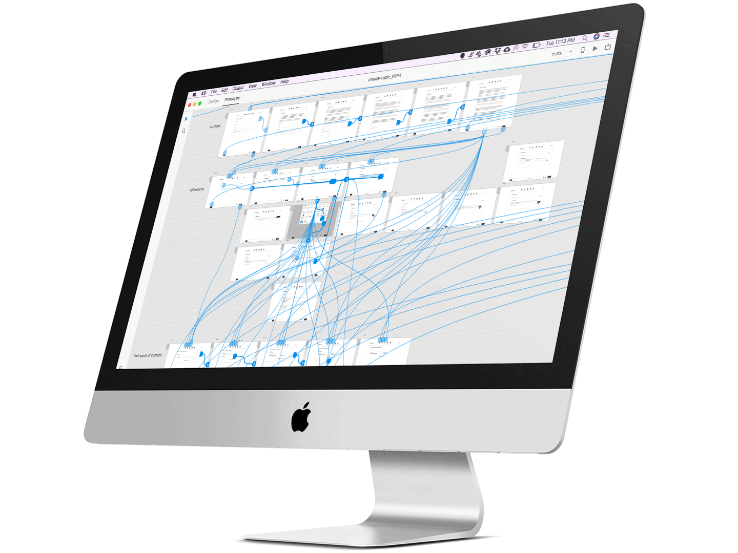
User Testing with Rapid Prototyping
ToolsUX DesignPrototypingUser Testing
Adobe XD, Invision, UserTesting.com Story
I, along with many, recommend prototyping your concepts/flows early (as possible) with customers to quickly gain valuable, irrefutable feedback. You can then take that data and insight to project teams and stakeholders to support enhancements, get buy in. This will not only reinforce design decisions but will also challenge your own biases/assumptions. It's okay to make decisions to create a "best first effort," but never rely on those alone. You should be looking toward your end user / customer to help you create the experience because that is who will be using it. 2018 -
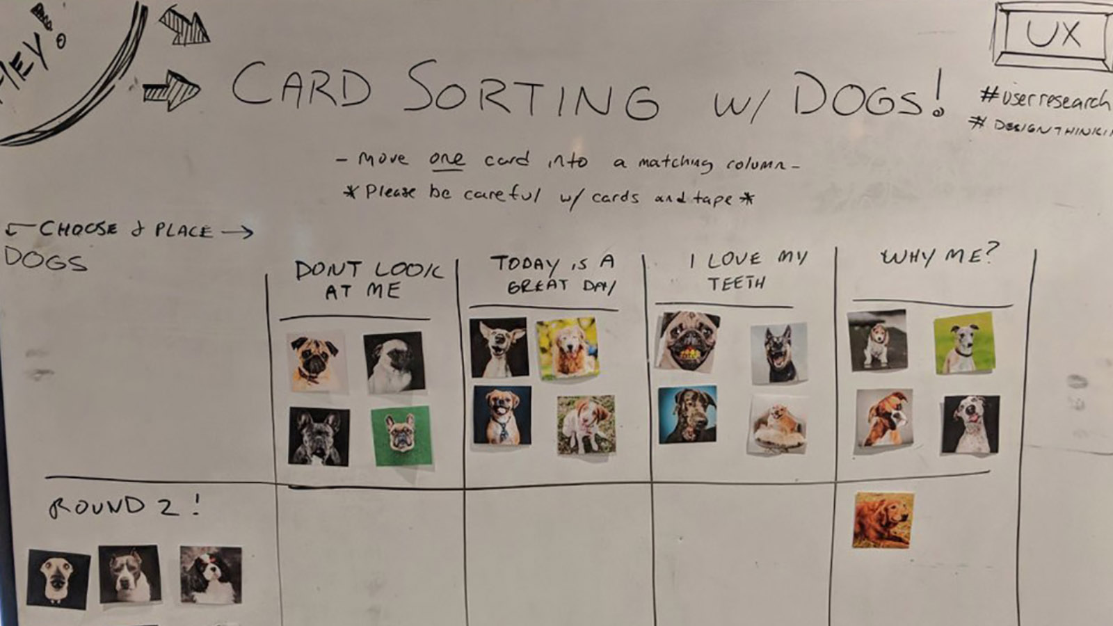
Card Sorting Practices
ToolsResearchIAStrategy
Paper, Markers. Whiteboard Goal
Promote design thinking across varius teams and organizations using fun, card sorting practices. Elevate engagement of these exercises with dogs or other animals. 2018 -
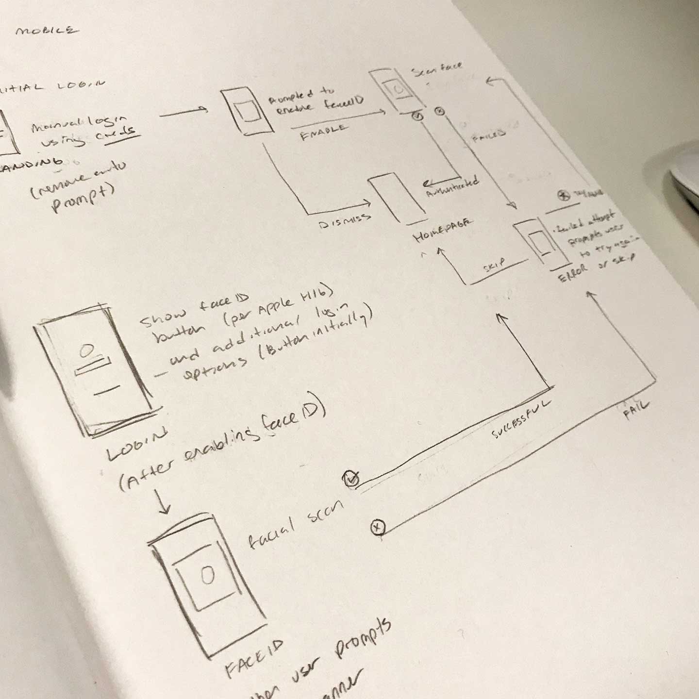
GEICO Mobile App: Face ID Wireflow
Tools Pencil, PaperResearchUX DesignStrategy
Story
Answering the question "what happens when FaceID fails?" 2017 -
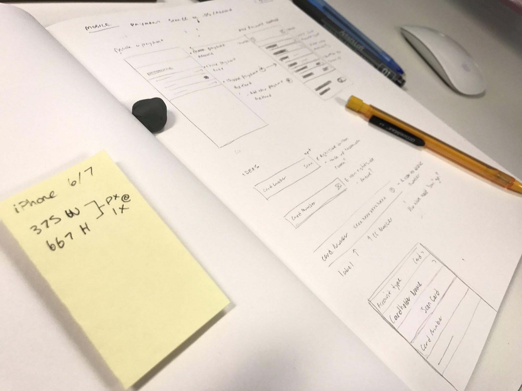
GEICO Mobile App: Payment Settings User Flow
Tools Pencil, PaperResearchUX DesignStrategy
Story
Exploring how a customer can scan their credit card(s) to save on an iPhone for future usage. Goal
2017 -
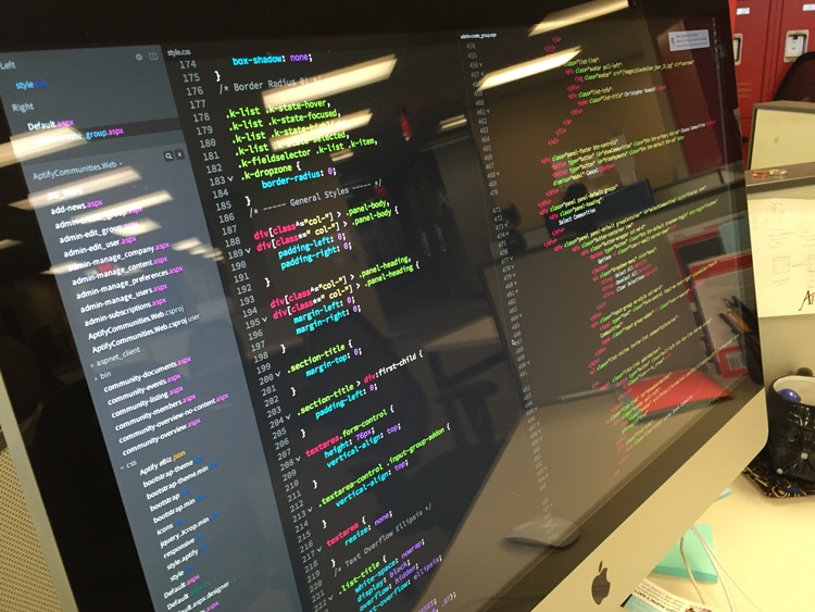
Building What I Can Design
ToolsFront-End DevelopmentUI Design
Brackets 2016 -

Align Mobile App: User Flow
ToolsResearchUser ExperienceStrategy
Whiteboard, Markers 2016 -

Align Mobile App: Redesign & Rapid Prototyping
ToolsUI DesignUX DesignInteraction DesignPrototyping
Adobe XD, Material Design 2016 -

Website Design & Rapid Prototyping
ToolsResearchUX DesignStrategy
Adobe XD 2016
-
I designed and built this site with my bare hands.
...and I know it isn't perfect. "Improvement is the path of Design."
-
-
-
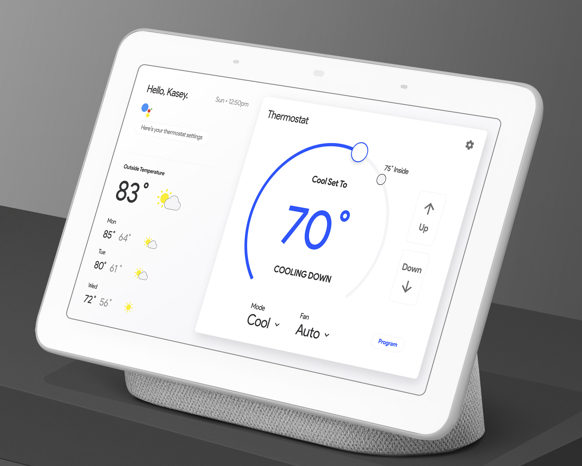
"Hey Google, what's the thermostat at?"
ToolsSmart App UXDashboard UIData VisualizationGoogle Material Design
Adobe XD Story
A desire to explore smart home products led me to work on a Google Home Hub experience - learning how humans can interact with a smart home device while learning how to design for one.
The persona I used for this practice represented my own Mother, a 61 year old who does not have a lot, if any, experience using a smart home product. I asked such questions like "if you had a digital thermostat what would you expect it to do?" After demoing the initial wireframes, she asked me how she could change the temperature. It was clear to me however after explaining the dial was interactive, she brought up concerns and questions. That led me to iterate. After demoing the mockup (above) she was intuitively pressing the up/down arrows to change temperture.
Google is known for gearing their products towards early adopters. This is probably not what they plan to do with their Home Hub but we what if we could create custom settings for more intutive experiences for older, senior level users? 2019 Dribbble -
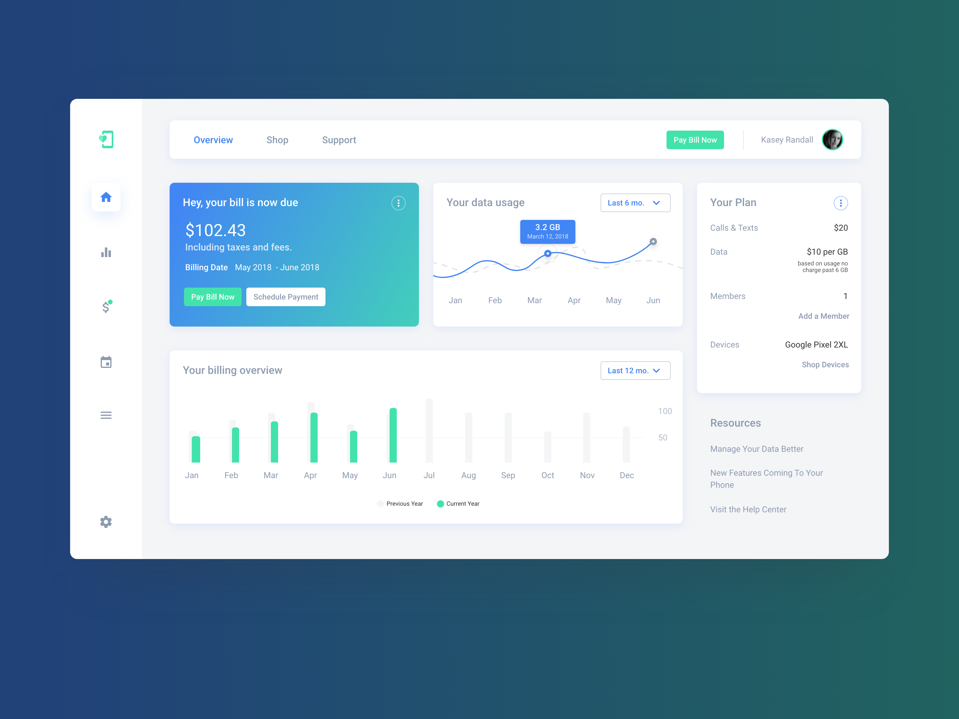
Pay Your Bill!
ToolsWeb AppDashboard UIData Visualization
Adobe XD Story
I sought to display the importance of advocating for simple and effective color choices. Using bold colors can pull a users attention to important elements. 2018 Dribbble -
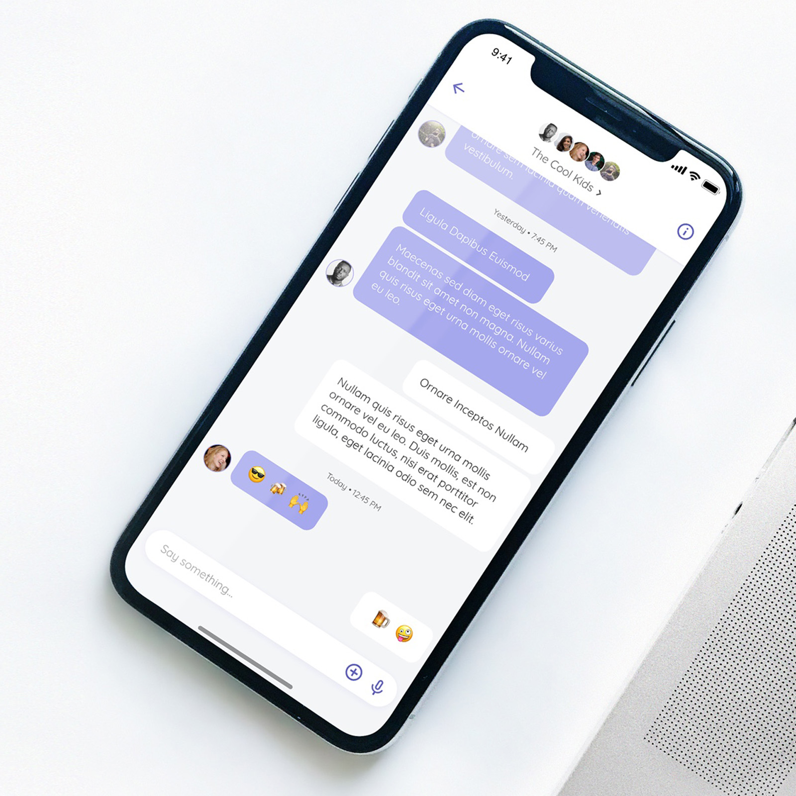
-
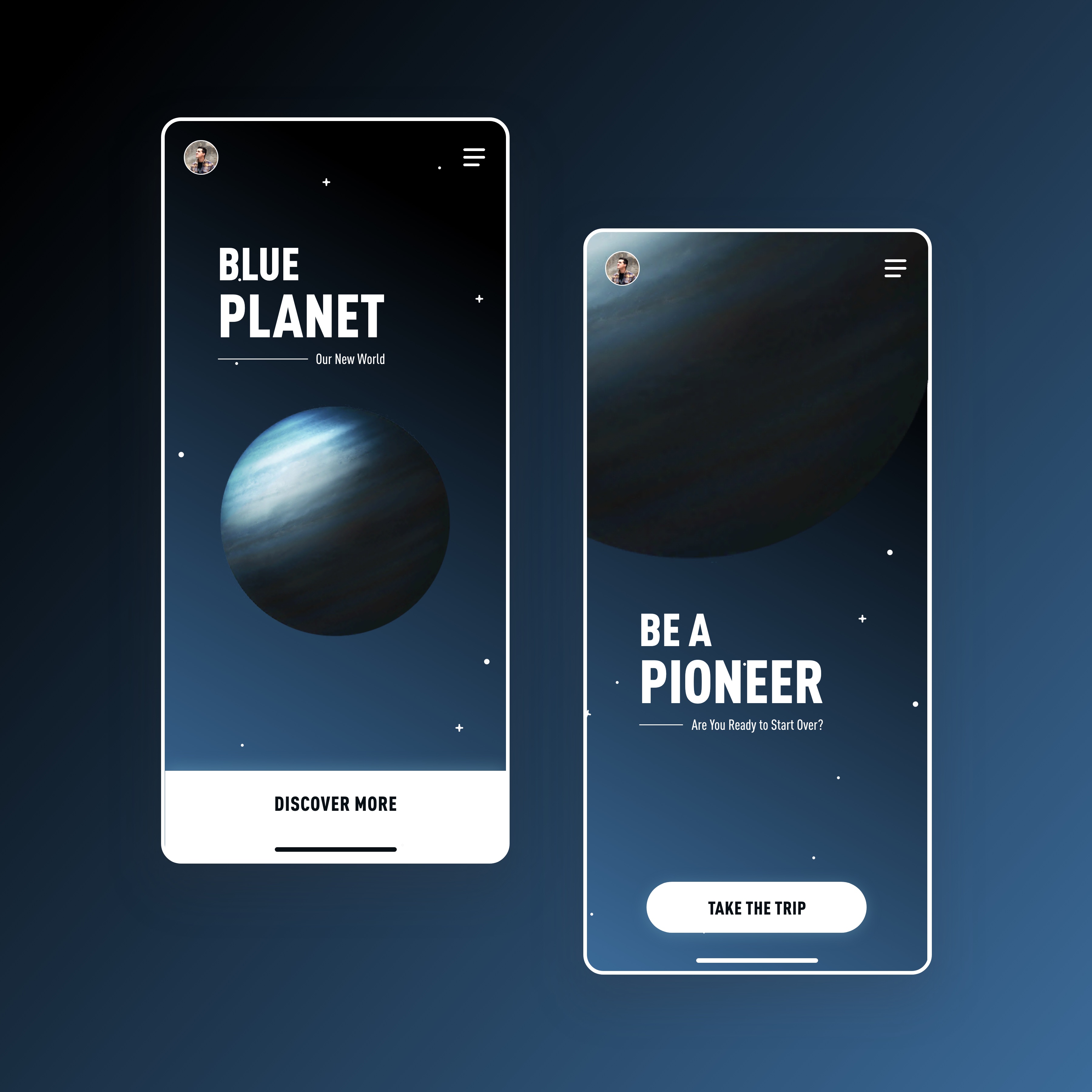
Blue Planet
ToolsMobile App Design
Adobe XD, Principle 2018 -
Adoptable
ToolsWebsiteMobileUI Design
Adobe XD Story
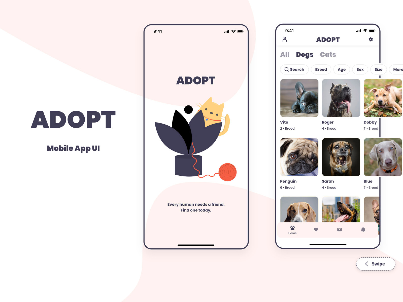
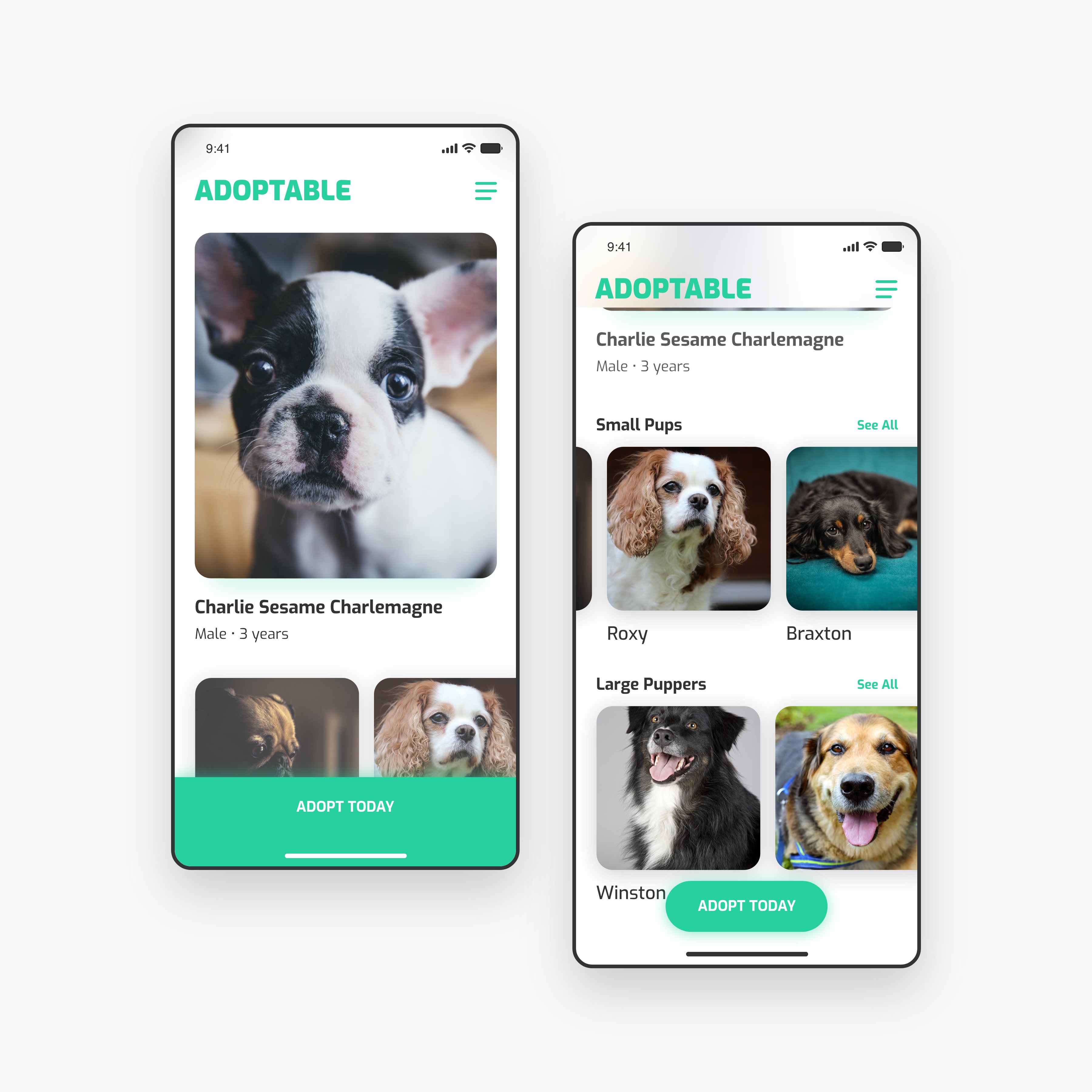
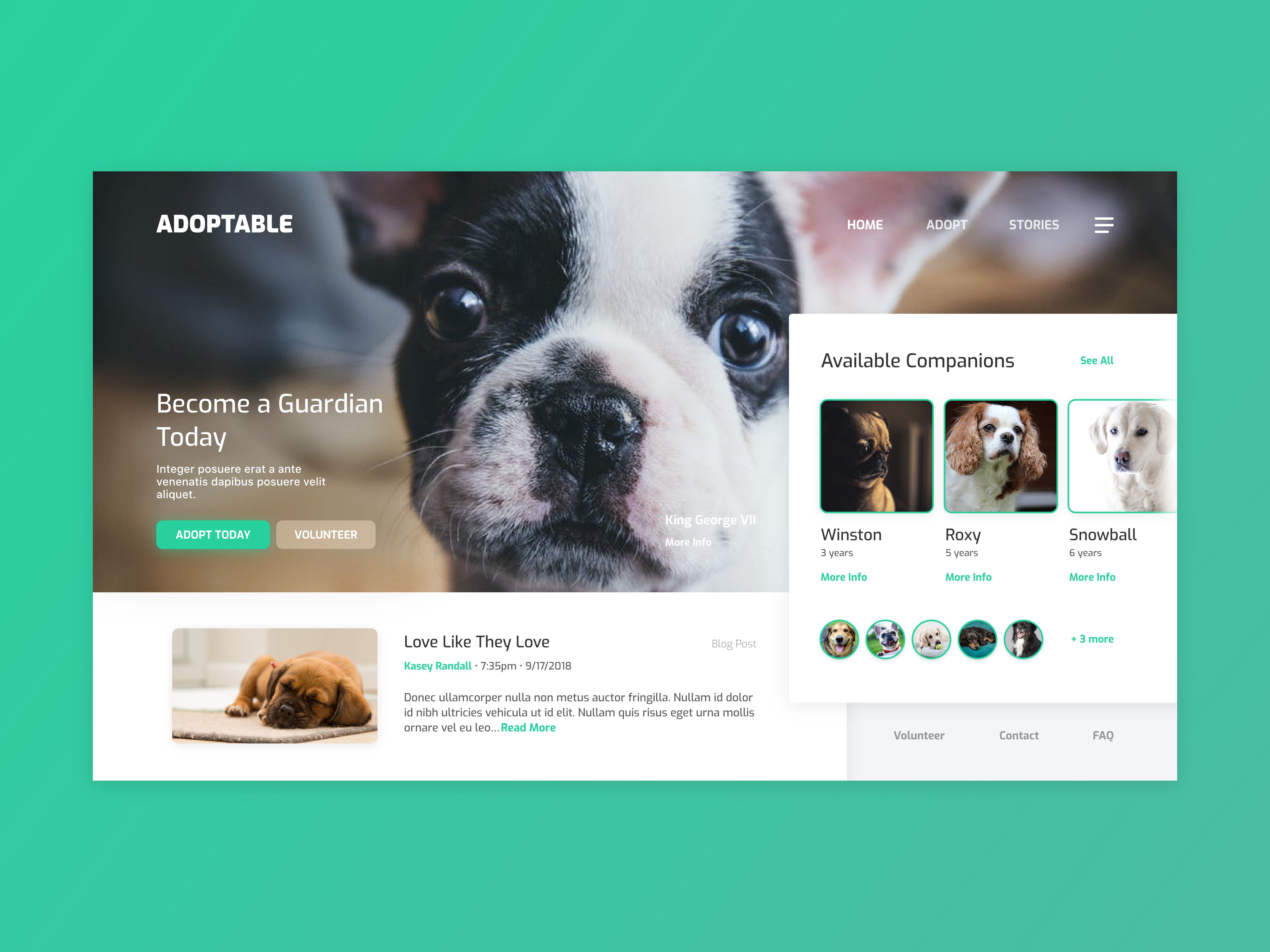
In honor of National Dog Day, this UI project was done for fun and to help get the word out there to adopt, rescue, volunteer, donate. Do your part to show these animals love, like they do. Goal
Promote animal adoption and rescue. 2017 -
-
-
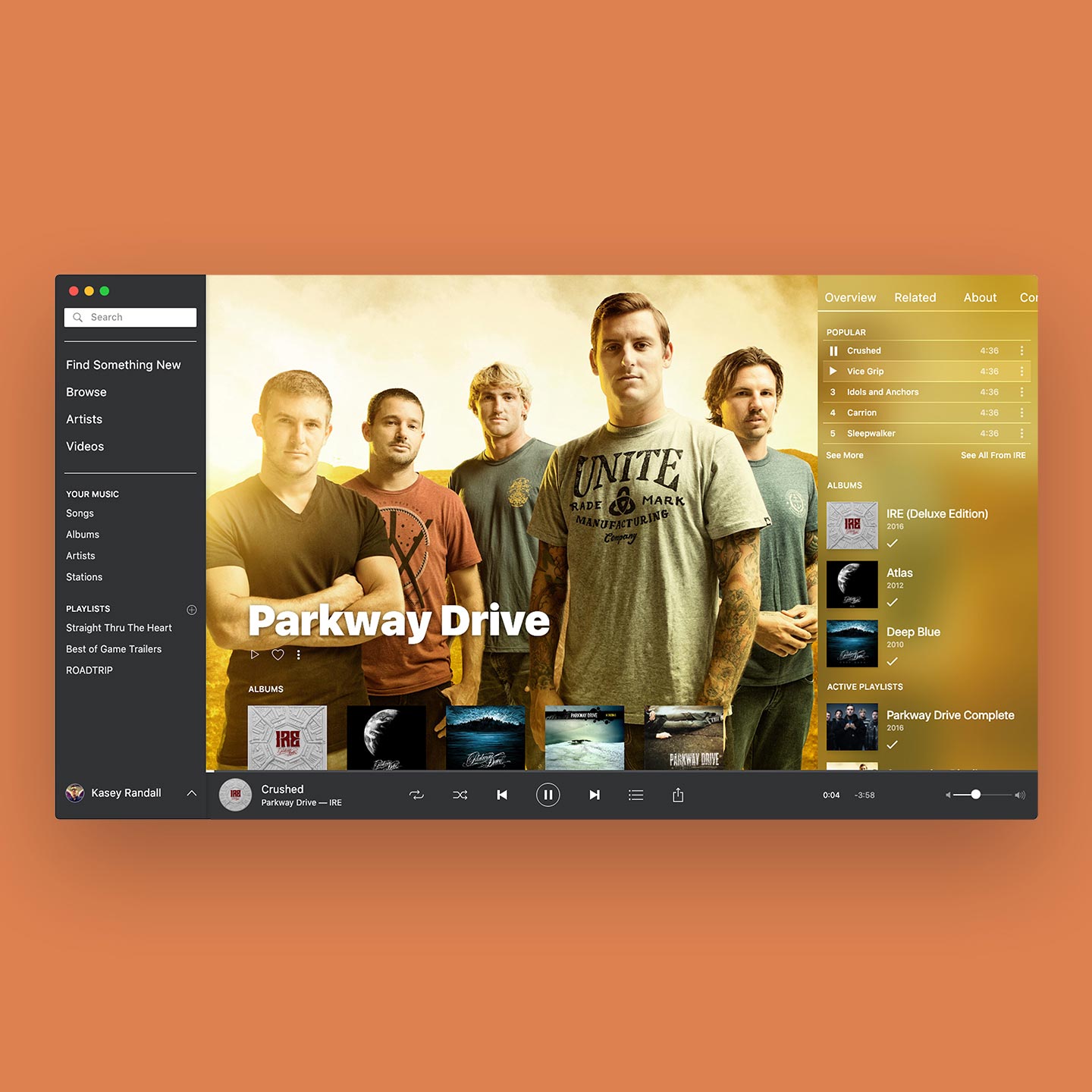
Spotify Concept
ToolsWeb Design
Adobe XD 2017 -
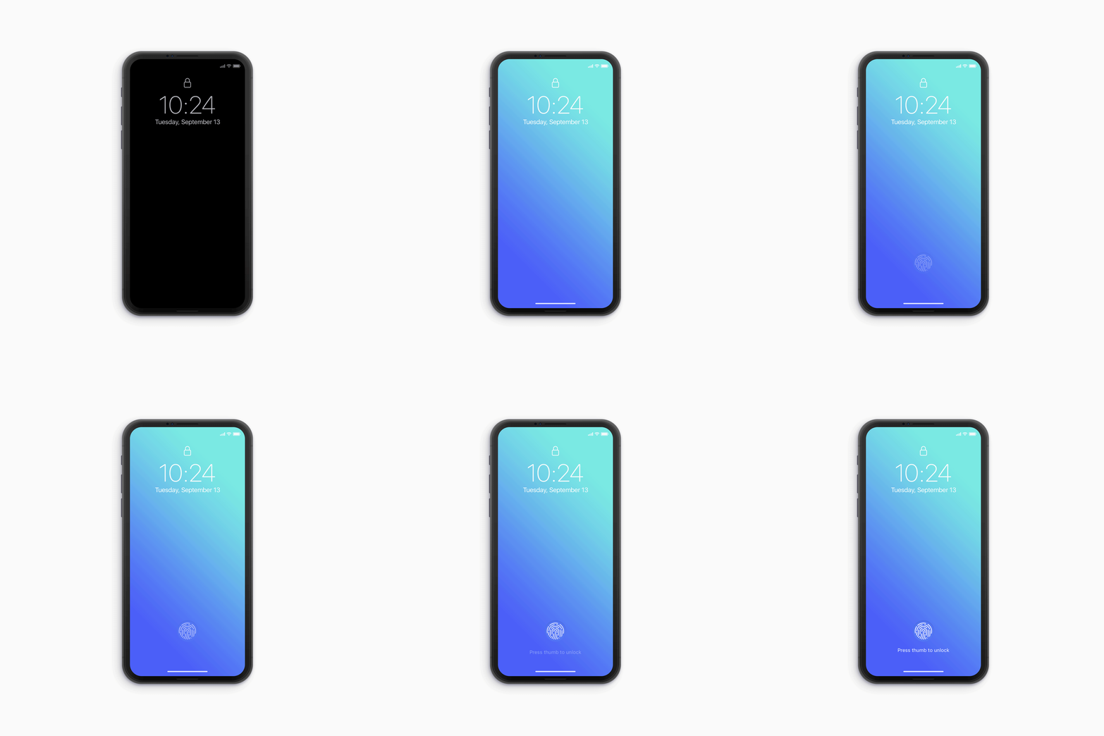
Future iPhone Concept
ToolsMobile App Design
Photoshop Fingerprint Sensor
After seeing a Coca-Cola ad display in Times Square (Link) that uses screens that protrude, creating a captivating 3D effect I thought, "what if our phone displays could do this with pixels?" And of course this is a concept and does not exist, yet. It's fun to dream. The idea is that the fingerprint sensor could present a tangible button in by caving in slightly. The sensor would become accessible when necessary and would vanish when not. Not only is this concept notchless, it gives the user the option of touchID again. Plus, imagine how much fun you'd have with the UI. 2018 Dribbble -

-
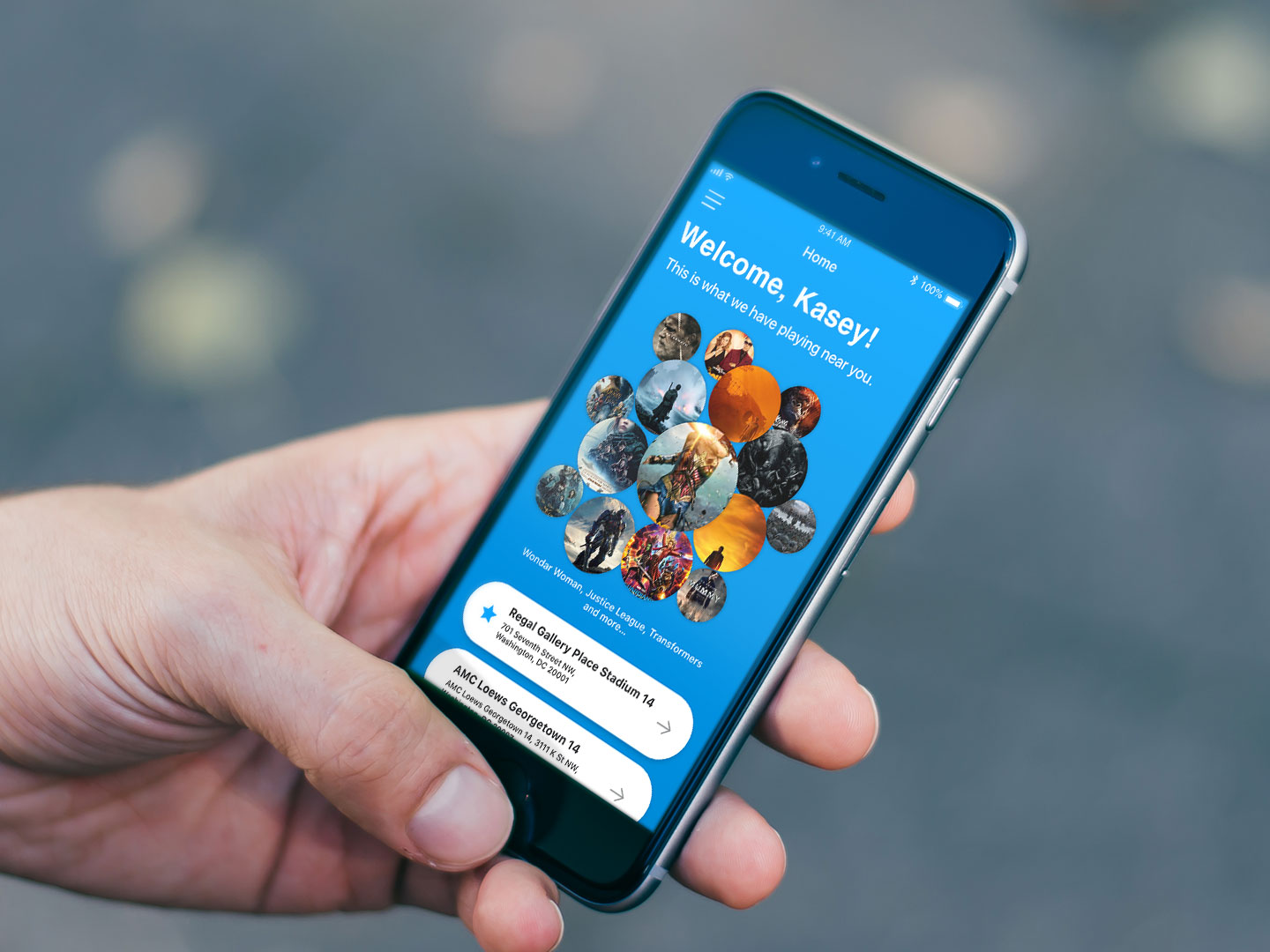
Movie Tickets
Mobile App DesignTools
Adobe XD, Principle Goal
Explore a better user experience through ordering movie tickets. Pain Points
Deciding on what movies to use. Struggles
Getting user research data by asking friends, family. 2017 -
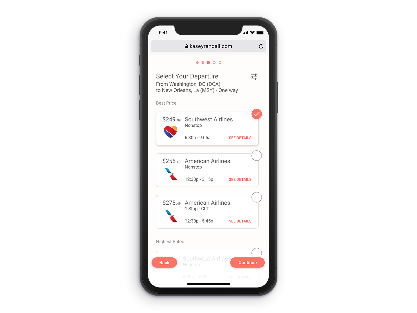
Book a Flight Challenge
ToolsMobile App Design
Adobe XD, Principle Goal
I wanted to explore a smooth checkout process and experience for picking a plane flight with a modern UI, keeping actions near thumbs reach. Mistakes
Airlines dont post tickets after a certain amount of time. I put multiple years in the calendar picker. Struggles
Laying out the calendar picker view. 2017 -
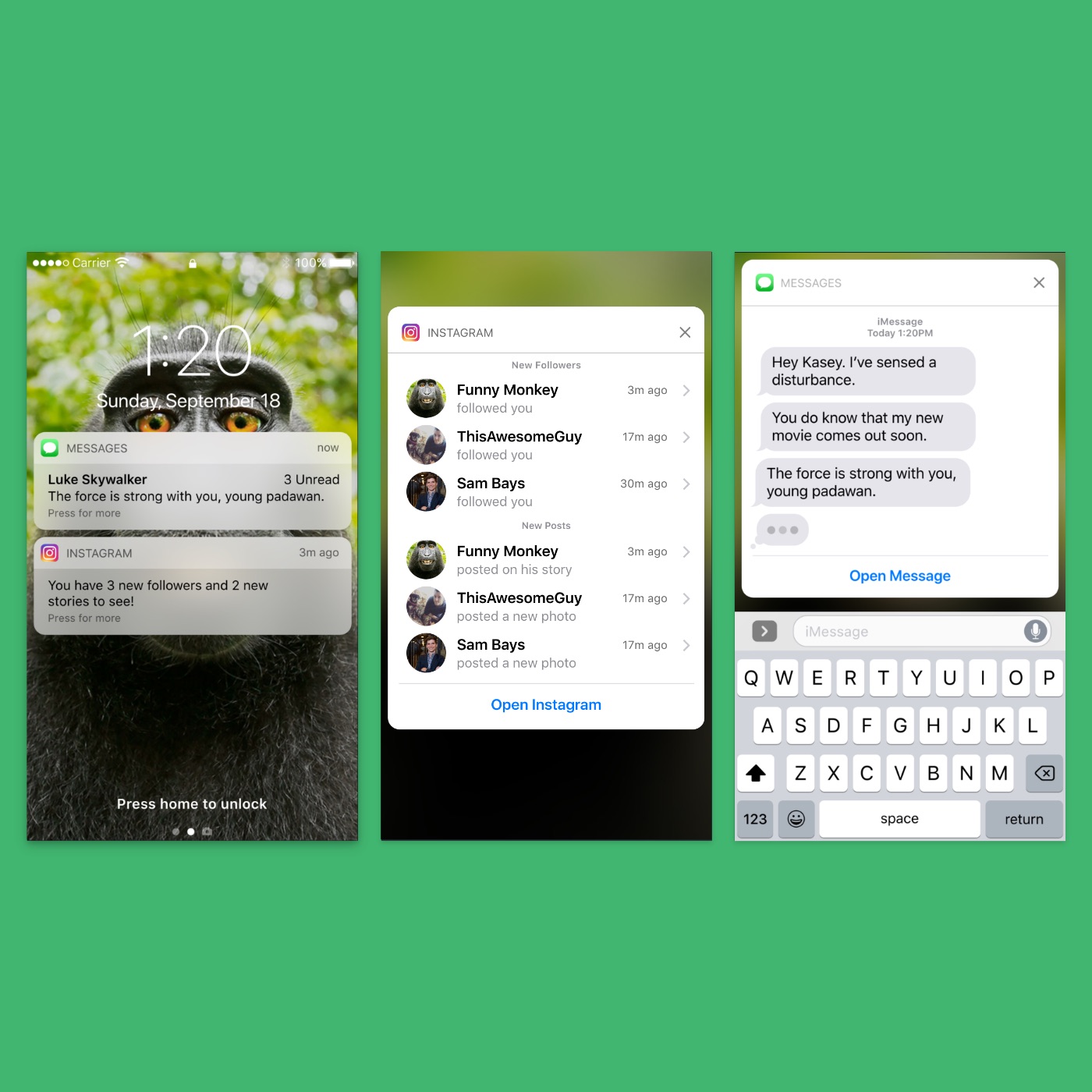
Nested Notifications
ToolsMobile App Design
Adobe XD, Principle Goal
Create a better experience by nesting notifications. Pain Points
Notifications window becomes over encumbered with cards that can't be organized. Struggles
Animating the elements to mimic that of an iPhone 2017 -
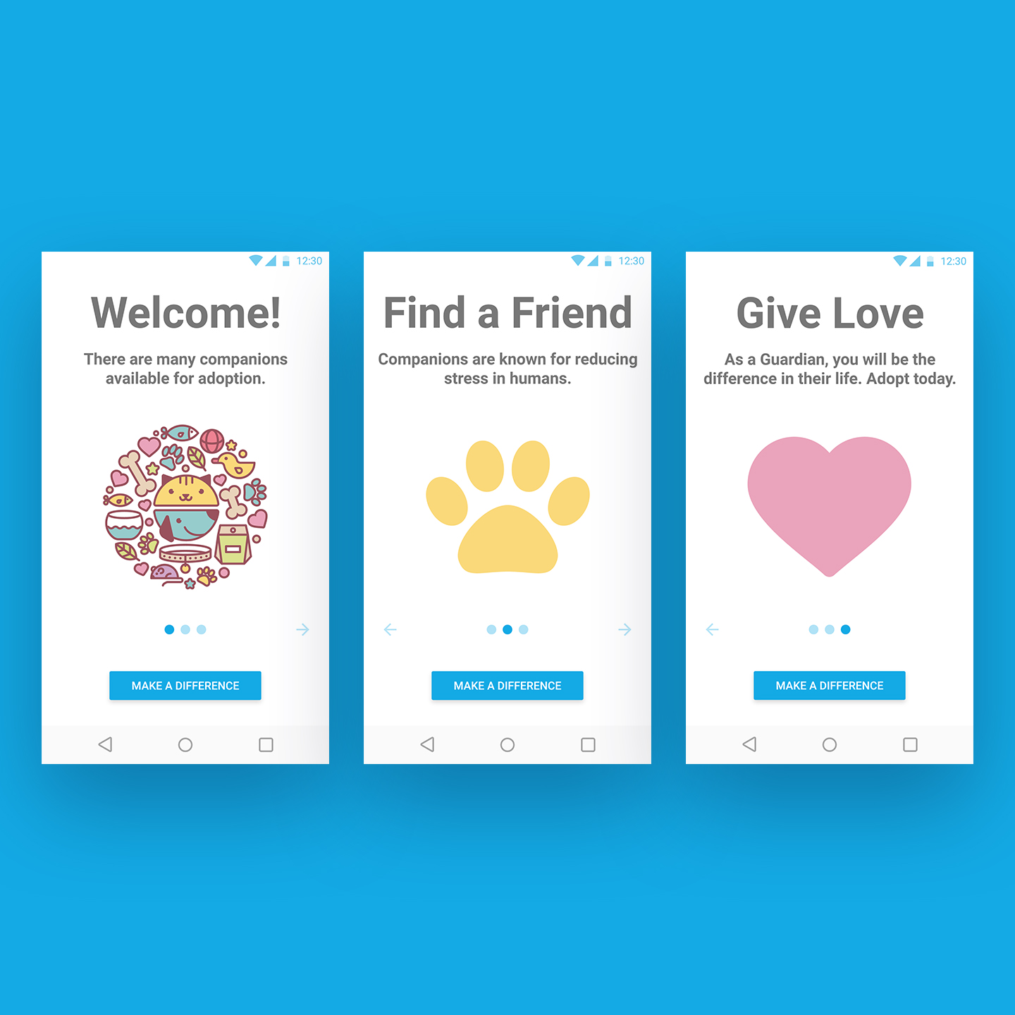
On-boarding Challenge
ToolsMobile App Design
Adobe XD Goal
Making pet adoption fun and easy. 2017 -
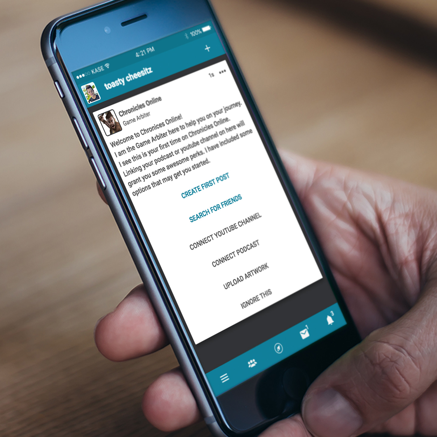
Chronicles the Game
ToolsUX DesignUI DesignMobile App
Adobe XD, HTML5, CSS3, Javascript 2016
